Game Design, Programming and running a one-man games business…

New Ship Hull Picker

Amongst other things (mostly sound related) I’ve been tidying up the ship hull ‘picker’ from the ship design screen, which was a bit fiddly and unpopular. The new one looks like this: (click to enlarge)

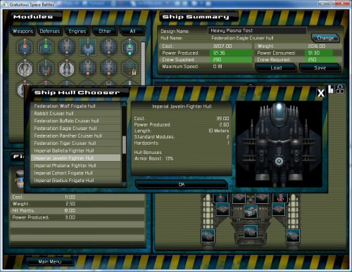
I wasn’t sure about the aesthetics of a three-pane look, but I’m assured it looks ok. I considered fading out everything behind it so the screen looked less cluttered. The big usability improvement (apart from the scroll wheel plus the keyboard up+down moving the scrolling list) is that hulls are sorted by race and by category, so you get all the alliance ships first, in fighter, frigate, cruiser order, then the next race etc…

I’m pretty convinced that is the sort of thing people wanted from it.

The performance slowdown on version 1.03 seems to be confined to certain hardware or windows combinations. I suspect it is related to the sound effects being sped up and slowed down, and this will be togglable in the next build, pending an eventual discover of exactly why that seems slow.  I’ve also been fixing tons of small Ui issues, and fixing some incorrect module data. The proper gameplay balancing hasn’t started yet, so if you think the game sucks because plasma torpedoes are too powerful 9for example), thats because I haven’t really got cracking on that yet.


12 thoughts on New Ship Hull Picker

  1. Fading out the background a bit when this is in the front seems like a good idea.

    Now, throw in a “compare this hull with” button. It should keep the selected one highlighted at the top of the list (or the window), and then the stats could have a +/- display in green (if more) and red (if fewer) while comparing. So like:

    Power Produced: 2.6 (+0.6)
    Hardpoints: 8 (-2)

    There’s probably a more elegant way, but this way would be quick! :)

  2. Agree with fading out the background.

    CLIFF DON’T YOU DARE HATE ON YOUR OWN GAME.

    GSB is _very, very well balanced_.

    I’ve been trying _hard_ to break the balance ever since it came out and even though you need to do kind of crazy things, I’ve never found anything I can’t counter. I LOVE GSB BECAUSE OF THIS.

  3. Like the idea with the fade out the background thing above, would like some thing so i can select a race to show just that race or select a class and show just that clases hulls.

  4. Ignore that last point, with the hulls ordered by race and then type it will be easy to navagate already.

  5. I second the background fading and comparison tooltips. Some comparison tooltips would be great for modules on the shipbuilding screen, as well (sorry if any of this has been mentioned on forums, I haven’t had much time to keep up with the beta threads).

    And yes, the game certainly doesn’t suck! It’s grand. The plasma launchers may be the prevailing strat now, but in general it seems quite balanced.

  6. The talk of tooltips reminds me…. could the delay for the tooltips be made even less on the main deployment screen for the column of ships?

  7. Hey I was just wondering if anyone can answer this for me but has anyone been able to run this on Windows 7?

  8. Something else that could be useful on the ship building screen is undo functionality with an undo button and/or CTRL+Z.
    I love the new look, btw! It’ll make it much easier to find and compare hulls.

  9. New ship hull picker is better then old one, still I would prefer to have a sort of a table with sortable columns. This way all stats would be visible at once :)

    Yet it should be nice looking and table is not so eye candy :)

Comments are currently closed.