Game Design, Programming and running a one-man games business…

Solar farm: The rough economic model

As you may know, I’m hoping to build a solar farm. In fact we are pretty far down the road of doing it. The current status of the farm is:

  • Grid connection quote accepted and £50k deposit paid
  • Lease agreed and waiting on final signature by landowner
  • Planning application applied for, currently being edited, waiting for final approval
  • Panels ordered and 10% deposit paid

To recap: This is hopefully a 1.2MWP solar far, (about 3,000 panels) in England, with a small element of battery storage (likely 256kwh or maybe 512kwh of battery). It will be grid-tied, and will sell electricity to the grid using a power purchase agreement (PPA).

So how do the economics of all this work? Well basically you spend a huge amount of money up front (maybe £1.2million) and then recoup that investment, with hopefully some profit, over the farms lifetime, which is often calculated at 25 years but is likely to be 40+. Thus the spreadsheet for the whole project looks like a catastrophic loss, easing gradually over time into a decent profit as the years tick by. Here are some rough numbers (but not *that* rough, as I actually have paid some of this now…

Up front Costs:

  • All the various bureaucratic nonsense involved in a big planning application: ~£30,000
  • A quote for a grid connection: £3,600
  • Initial fee to landowner (one-off) £10,000
  • Solar panels, inverters and installation: ~£680,000
  • Grid connection: ~£150,000
  • Battery: ~£240,000
  • Total up-front cost: ~£1,200,000

Yikes.

Now lets look at the ongoing costs:

Ongoing Costs (per year)

  • Rent to landowner: £5,000
  • Insurance: £2,000
  • Maintenance: £4,000

There are also some other costs that its easy to forget such as…

  • Accountancy for the company £660
  • Energy trading software subscription: £420
  • Cost to replace all the inverters once: £1,200

The Economics

So is this profitable? Well… it depends. Hopefully! Basically its a bet on the long term wholesale price of energy. In the UK we have an ‘energy price cap’ which a rather economically illiterate government introduced as a popular measure to prevent people’s fuel bills going too high for their political comfort. Of course, we could invest in more infrastructure and better insulation but…nah. Anyway, this is thankfully not a concern in the world of energy generation because the wholesale price is uncapped, and has been skyrocketing.

In normal years, the fact that the price of solar panels has shot up and labor costs have shot up too…would be devastating to the economic case for solar farms, but luckily wholesale energy prices have been crazy high too. This was BEFORE the Russia-Ukraine war, which has pushed them up even further.

The bad news is… the figures I have may all have to go up because of rampant inflation. However, assuming they do not, the break even point is now:

  • 13 years at a wholesale cost of £60/MWH
  • 9 years at £100
  • 6 years at £140

Right now, PPA (purchase power agreements) are super-high at around £200, but this is unlikely to last, especially with so many big new energy generation facilities coming online. The situation is very complex because supply side we have these factors:

  • Closure of old nuclear plants
  • Opening of new nuclear at Hinkley point
  • Potential new small nuclear power
  • New wind farms coming online
  • New large-scale solar coming online

Meanwhile on the demand side we have:

  • Rollout of electric cars in the UK
  • Phase-out of gas boilers in favor of air source heat pumps
  • Phase out of gas-for-power as we strategically move away from foreign gas reserves to home-generated power.
  • The push for Net Zero / Climate change concerns.

So when it comes down to it, this is a BIG BET, that the demand side outweighs the supply side. I think this is a good bet, but its still a risk. if it pays off well, it might be a very profitable investment, but if that happens, I’m not going to feel guilty about it. It could easily go wrong, and actually LOSE money, so there has to be a risk-premium attached to locking up this money for 25-40 years (effectively the rest of my life).

I’ll do an updated post once I have more information, especially if we actually get planning permission, and a signed lease and then firm battery quotes (because that means the rent is definitely fixed, and I have a real battery quote, not a guess).

Thoughts on potential Democracy 4 expansions / DLC

Democracy 4 has been released from early access over a month ago, and has had 2 big updates since then, and further updates to the game, especially regarding balance tweaks, are definitely coming. However, I am a big fan of the ‘expansion pack’ model of the business, because I think it has a number of positives:

  • It allows players who are only casually into the game to play an approachable and simple base version
  • It gives scope for players to choose which expansions to get, based on their level of interest
  • It means that I can learn from peoples’ feedback on the base game and produce the sort of extra content people might want

Of course, the big question is exactly what part of the game to expand upon or add to. There are a bunch of ideas floating around in my head, and I thought it only sensible to get those ideas out there in the wider world to canvas feedback from real players of the game, so in no order at all, here are some idea.

DLC idea #1 Voting Systems

We already did an electioneering expansion pack for Democracy 3, but all of that content is already included for free in the base game for Democracy 4. However, I think there is a lot of scope here. For example, right now the player has no influence in direct terms, on the voter turnout. We could add policies to encourage voter turnout, like information campaigns (which may or may not benefit you, depending on your electorate). Perhaps polling data could show what the result would be like when polling only likely voters! Also we could model voting reform, so whether or not to lower (or even raise) the voting age, whether party donations are capped, or can be anonymous, can come from corporations or foreign nationals…

There could also be some modeling of campaigning tactics. I like the idea of the player having to choose from a list of different metrics (GDP, Unemployment etc) on which to focus a year before the election, so the player has to be wary of what they drew attention to in their campaign literature. We could also allow attack ads, at a possible risk of backfiring.

Also, some countries like the UK ban political TV ads. We could have this policy, and also maybe a ban on robocalls. We could also have limits on who can stand in elections (US president must be US born etc), and if the state funds political parties at all.

Electoral reform: the fine print matters : Democratic Audit

DLC idea #2 Situation Room

This one would expand on the terrorist threat element already in the game. I’ve spent a fair bit of time on this idea. Basically it would introduce time-limited decisions to the game, where a serious threat or event takes place and the president (you) has to make a decision on what to do RIGHT NOW, in a ‘the clock is ticking’ style. This would mean no time to consult a lot of data, and a gut decision.

An example dilemma is shown below. I think it would be interesting if the advice and intelligence given in these sudden events would be dependent on how involved your intelligence/security network was, so it would be harder for liberal democracies, and easier for more authoritarian states, to add some tension between liberal principles and security:

dlc1mockup

I think of this idea as a sort of ‘west-wing situation room meets 24’ style political thriller expansion, where the player has to deal with lost of situations that with any luck, the general voting population never even hear about. We could have dirty bomb threats, suicide bombers, espionage from other countries, and the possibility of using illegal measures covertly to protect the security of the country.

In game-mechanic terms, I keep coming back to the idea of this involving what are in effect spruced-up dilemmas, but with a timer, and no opportunity to gather extra dat and come back to them.

DLC idea #3 Dirty Tricks

This would basically be a corruption, scandals and dirty tricks expansion, where the game effectively tempts you to be corrupt, with potentially bad consequences later. We can all sadly come up with tons of ways in which we could model this. I know one game (might be tropico) actually used to let you put money in your own private account, and we could do a similar thing here, literally taking money in exchange for policies :D

I think there is a lot of scope here. You could order the secret service to look for embarrassing or compromising information on opposition leaders or campaigners. You could literally bribe the press to give you better media coverage. There would be an option to just flat out lie about some government statistics, to prosecute whistleblowers, to threaten journalists and so on.

We have a very slight element of this in the game already whereby general media censorship means that political media spin events are more likely to be perceived as positive. However, I can imagine it being an option where an event clearly backfires but you can then choose to flat out threaten any journalists that reported on it.

Intimidation at polling stations by violent gangs ordered indirectly by you would also be included here.

Perhaps we could track both your own morals (on a good -> corrupt axis) along with your private bank account, as things that a player could choose to focus on for their own satisfaction :D. I can imagine an interesting situation where players who decide to play a game completely fairly and with principles would be tempted before a difficult election to bribe some journalists “just this once” etc.

Justin Trudeau anointed by Richard Nixon - at four months old | Canada |  The Guardian

DLC idea #4 Country Pack

Pretty self explanatory. I think there are a bunch of interesting countries that could be added to the game. Switzerland strikes me as interesting, as does Poland, maybe also Turkey and perhaps a country like Honduras. I think the goal would be to pick interesting countries, not just ones with the most players, and take the time to represent them as well as possible, so doing a lot of research into the economics and political environment for each one. That probably involves a bunch of new policies and situations and dilemmas for each country to represent their specific challenges.

West Bay Beach - Roatan Island, Honduras - West Bay Beach, West Bay  Traveller Reviews - Tripadvisor

Anyway… I have not decided yet, and am not currently working on DLC, but I was interested to get anybody’s first reaction to which direction to head in. I’ll check comments here, and post a twitter poll at https://twitter.com/cliffski/status/1504400682836758541

Another tweak to voter approval visualization

I blogged very recently about adding voter approval distribution data to the polling screen in Democracy 4. This is going into the next game update, but I’ve changed it since then and thought I would explain why. The aim has been to give the player some insight into the actyual distribution of voters over the whole range of approval values, rather than giving just two numbers at any point in time (which in a 2 party system are the ‘average’ of all voter approval values, and the percentage of voters for whom their approval exceeds 50%).

For reasons discussed before, these numbers, while interesting give no insight as to whether your current support is soft or reliable, so they are imperfect information.

Consider an example. The player is 2 turns before an election, their approval is 60% and their voting intention is 85%. The player has a fairly socialist-leaning electorate, but they are trying to move towards capitalism, and one of the steps along their desired path to this, is to privatise state industries such as rail. They are trying to decide if they should go ahead and privatise rail right now.

In one scenario, their support is pretty solid. The voters approval is distributed pretty evenly across the spectrum. Obviously an approval drop across the board will result in everyone slipping down slightly, but enough voters sit really high in the distribution that the voting intention will happily stay at 70-75% even with a drop in average approval.

In another scenario, their support is super-soft. Basically almost all of the voters are in a single big blob of approval hovering around the 60% mark. The unpopular privatisation might shift that whole bubble low enough to actually drop voting intention below 50%, losing the election

Right now, the player could go check the parties screen with the chart on the right giving them clues about the distribution, or the ‘everyone’ happiness distribution, which shows the same thing, but the data was never present on the polling screen, and more relevantly, it was only ever shown as an instant snapshot. Here (below) is my final implementation on the polling screen.

This is a new ‘optional’ view, thats turned off by default. (The checkbox to the right turns it on or off, and a tooltip over that area explains what it shows). This now shows the distribution (bubble sizes in the y axis) over time (the x axis, with the right being the present day).

I spent LOTS of time trying out different methods to show a bunch of stuff here. Initially I just had the background blobs, but they were all one color (feint green). I then realised that what was actually helpful here was to show what party the voters were going to vote for, so I added some feint red lines to show ‘voter thresholds’ for each party. This needs explaining:

In a 2 party system, the code is simple. Voters check their approval, and assuming no external factors (electioneering stuff, or party membership), they vote for the player if approval >50%, and for the opposition otherwise. In a 3 party system, there is a middle party, so you are looking for 60% approval to get their vote, with 40-60% approvals going to the middle party. However… its not quite that simple!

These thresholds MOVE over time. The game takes into account the fact that parties shift their position. This is the famous overton window, coded into party strategy. In short, if you are winning, the other parties move their (unstated and hidden for game purposes) positions in policy terms closer to your own. That means those 40% and 60% thresholds become more like 45% and 65%, or even closer. As you would expect, the reverse is also true. When you are doing badly, the opposition parties move further from you, so those thresholds can drop as well. This has been in the game for ages, but was not easily viewable by the player.

The chart above is actually fiendishly complex, because it displays a 2 axis chart with 2 lines showing different things over time (voting intention and average approval) and ALSO a backdrop that shows a four dimensional data set describing voter approval distribution and voting intention!

How come four dimensions? Firstly time (x axis) secondly approval (y axis), then the distribution of voters in each of 20 vertical groups to show the distribution of approval (size of each blob) and lastly the voting intentions within each blob (the colors of the blobs, or partial colors, indicating which party each voter would choose if the election happened that day.

No wonder its hard to get the GUI right :D

Anyway… it seems arcane, but it is actually all in the chart. You can see if you look closely that the point where voters switch from voting red, to voting blue, does not stay a fixed line over time, its actually changing in response to the popularity of my own party, which is based on the voters approval. (note this is a 3 party system, parties are red, blue and green, with green being the player).

If it sounds tricky to imagine as UI its even more annoying to code. I coded it as a sparse rendered system, instead of just generating, for example, 3 different colored circles for every x axis and y axis position. Even if you don’t draw them, that means 20x20x3 = 1,200 sprite objects being created, despite the fact that only a fraction will need ever drawing (most points on the chart have one single color circle, or are even unpopulated entirely.

Anyway, I think it adds some helpful extra data to the screen. I probably need to improve the tutorial/guides/in-game help at some point to explain it all though :(

On the visualization of voter approval distribution in Democracy 4

My politics game, Democracy 4, has a user-experience issue. Its not critical, and its less prevalent in Democracy 4 than any of the other games in the series, and I am working on fixing it, but it remains an issue nonetheless. the fact that this issue is based on real world phenomena does not make it any less frustrating for a player who experiences it.

Some background: The game is a ‘run the country simulation’, that models an entire country, and the electorate are represented by 2,000 simulated AI voters. Those voters go through a very complex web of calculations to decide what they think in the years that you are in power, and at election day, they cast their vote either for the player, or for one of the opposition parties. In a two party system, the decision is quite simple, as players who have a . 50% ‘approval’# of the government vote for the player, and the rest vote for the opposition.

During the game, the player can regularly check on how they are doing regarding polling, by checking out a screen that shows two graph lines. One of these is voting intention, and the other is average approval. This is a NEW thing for Democracy 4, because previously we would only show voter intention. The difference between the two is incredibly, incredibly important. Let me explain why.

An individual voter has a fluid measurement of their approval, in that it ranges from 0% (Hardline hatred of the government) to 100% (fanatical dedication and loyalty to the government). However, for most people they likely hover closer to the center. Not many people would sacrifice their lives for, or against a government in a western democracy. So people’s opinions float around. For many, that float is always above 50%, or always under 50%, but depending on how the government is doing, a lot of people might float below and above that line, and pollsters call these people ‘floating voters’.

Here is the problem: Although approval is fluid, voting is binary. On election day, assuming you vote, you vote for the government, or you do not. You don’t vote ‘more’ or ‘less’ for the government. You either ticked the box or did not. Thus, its important to realize the distinction between the two systems of measurement. The graph above illustrates the difference. Voting intentions in blue are basically a binary poll of yes/no on the government. The green line is the aggregate of asking everyone to rate the government on a 1 to 100 scale. These are MASSIVELY different.

Take an extreme example, where everyone in the country thinks alike. The government has been…ok, but a bit corrupt, a bit untrustworthy, but the economy is doing well. On balance, the consensus opinion is that the government rates as 49 out of 100. When everyone is asked in a survey, they give the same answer, so average approval is 49%. Not bad. However, if forced to vote now, everyone would naturally vote for the opposition, so the election result would be 0% votes. Absolute defeat.

Then the next turn (3 months in game time), a surprise event happens. Scientists make a breakthrough in quantum computing, thanks to a science budget you raised 2 years previously. This good news bolsters the stock market, some voters feel a bit more wealthy, and this boosts GDP just a tiny fraction, pushing wages up just a tiny fraction. Everyone in the country is just a tiny bit more satisfied with the government, hardly noticeable. Maybe 2% difference?

Now its election day, and again, if answering a survey people give very similar results to before, but just slightly better. Average approval has nudge upwards just a fraction to 51%. Barely noticeable on the green line. However, the election is again binary, so given their new scores, every single voter in the country votes for the government. An overwhelming landslide of historic proportions. Total electoral dominance. The blue line shoots to the top of the graph!

This is why the two-lines are introduced into Democracy 4, because in theory, this could really happen. A slight change in voter happiness can yield a massive electoral win…or unexpected crushing defeat. And when I have paragraphs of text to explain how it works…this makes sense. The trouble is, I’m not there to give post-election analysis to every player who thinks the game is broken because of a sudden reversal of fortunes…

In practice, this problem is not overwhelming, because the voters in the game are very sophisticated AI models of widely varying people. Voters might be in 10 different voting groups, each at different levels of membership, and are being pulled in many directions at once, as you can see in the focus group screen:

…so in most cases, for most players, at most elections, this does not occur that wildly. But nevertheless, its possible, and a good game would never surprise the player with what seems like an unfair loss, or an unfair win. They have to be able to see immediately what is going on.

Funnily enough, all the information the player needs to understand this is already in the game, its just not necessarily in the right place. For example, I present to you the parties screen:
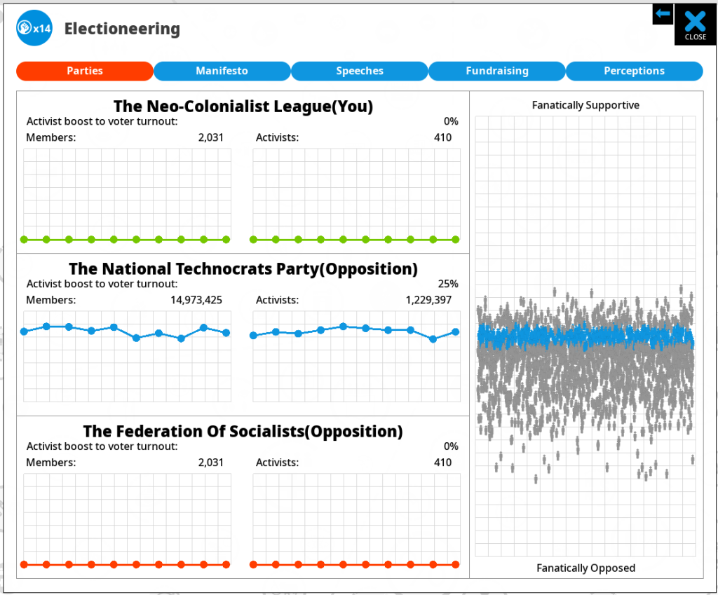
This represents approval as the Y axis (chart on the right btw…) and plots every single AI voter. Depending how distributed they are, the effect we describe may vary. In my nightmare 49/51% example, every voter is on the same horizontal line just moving up and down. In this case, the voters ARE very clumped, and just below the point of approval where they would vote for me, as this is a 3 party country, and they are tempted by the middle party. Right now, this is dreadful news for me, and awesome news for the middle (blue) party, but given the voters are so similar, if I can shift my policy positions closer to those the voter’s prefer, I should get an overwhelming avalanche of voters tilt my way!

This is also something you can see if selecting the ‘happiness distribution’ button on the ‘Everyone’ voter group. This time its represented on an X axis, where the left is 0 (angry) and the right is 100% (happy):
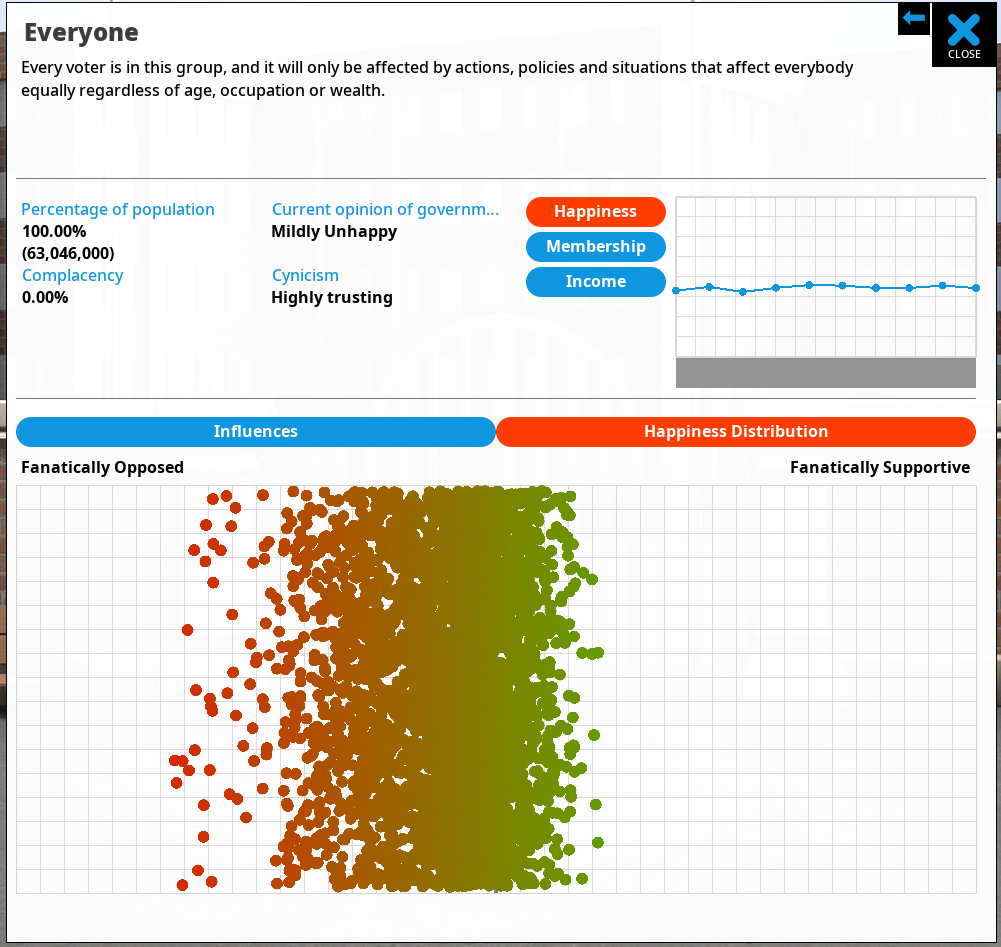
This is the same game, with the same voter distribution, and as you can see, in this case (start of game for the UK), its pretty clumpy. BTW the color of each dot represents happiness. Those green voters are happy, but they need to be super-green to vote for me, as there are 3 party options.

So all the information is kinda there, but people still don’t understand those wild swings in voting outcomes. As a result I have decided to try and represent it another way, in another position. I think that in general, players are expecting to get all their polling information from that earlier polling screen, so if I am going to represent voter approval distribution I need to do it there. PLUS, ideally I need to show it changing over time, not just a snapshot in time which is how its shown on these two graphs. Here is my current solution:

Same chart as before, but the background is now filled out with some extra information in the form of green blobs. These are presenting the voter approval distribution at each point in the game. The larger the blob, the more voters it represents. Over time, the blobs both move and change size, as the opinions of the electorate change.

The ideal situation for the player is to have substantial big green blobs way above the line, so they represent committed voters who are unlikely to suddenly drop below the line. If you have the green and blue lines above the threshold…BUT… there are large green blobs right on the line… then this represents fickle voters whose opinions might easily shift against you.

In code terms, each turn I’m asking each voter what their approval is, and sticking them in to one of 20 vertical ‘buckets’ of popularity. Each of these is a blob. Then in the chart I’m showing the number of people in each of those buckets by the size of the circle. Its more complex than it sounds because you need to work with circle areas, not radius, and also do some pre-processing to detect the largest blob, so you can then scale everything so the blobs are as large as possible (for legibility) while also being in proportion to each other and thus accurate.

The HUGE challenge is, as ever, not technical but UI/UX related. Does this help? does this make sense? and given that players often do not read tutorials, guides or walls of text, is it conveyed clearly enough just by the phrase ‘approval distribution’? Does the red approval line need its own key to explain what it is? (I think maybe so).

As always I’m interested to hear what people think. There is a complexity cost in adding this (it complicates this graph, potentially distressing newer and more casual players), and I need to be confident that the increased visual complexity is offset by the greater insight for the player into what is happening out there in opinion poll land…