My politics game, Democracy 4, has a user-experience issue. Its not critical, and its less prevalent in Democracy 4 than any of the other games in the series, and I am working on fixing it, but it remains an issue nonetheless. the fact that this issue is based on real world phenomena does not make it any less frustrating for a player who experiences it.
Some background: The game is a ‘run the country simulation’, that models an entire country, and the electorate are represented by 2,000 simulated AI voters. Those voters go through a very complex web of calculations to decide what they think in the years that you are in power, and at election day, they cast their vote either for the player, or for one of the opposition parties. In a two party system, the decision is quite simple, as players who have a . 50% ‘approval’# of the government vote for the player, and the rest vote for the opposition.
During the game, the player can regularly check on how they are doing regarding polling, by checking out a screen that shows two graph lines. One of these is voting intention, and the other is average approval. This is a NEW thing for Democracy 4, because previously we would only show voter intention. The difference between the two is incredibly, incredibly important. Let me explain why.
An individual voter has a fluid measurement of their approval, in that it ranges from 0% (Hardline hatred of the government) to 100% (fanatical dedication and loyalty to the government). However, for most people they likely hover closer to the center. Not many people would sacrifice their lives for, or against a government in a western democracy. So people’s opinions float around. For many, that float is always above 50%, or always under 50%, but depending on how the government is doing, a lot of people might float below and above that line, and pollsters call these people ‘floating voters’.
Here is the problem: Although approval is fluid, voting is binary. On election day, assuming you vote, you vote for the government, or you do not. You don’t vote ‘more’ or ‘less’ for the government. You either ticked the box or did not. Thus, its important to realize the distinction between the two systems of measurement. The graph above illustrates the difference. Voting intentions in blue are basically a binary poll of yes/no on the government. The green line is the aggregate of asking everyone to rate the government on a 1 to 100 scale. These are MASSIVELY different.
Take an extreme example, where everyone in the country thinks alike. The government has been…ok, but a bit corrupt, a bit untrustworthy, but the economy is doing well. On balance, the consensus opinion is that the government rates as 49 out of 100. When everyone is asked in a survey, they give the same answer, so average approval is 49%. Not bad. However, if forced to vote now, everyone would naturally vote for the opposition, so the election result would be 0% votes. Absolute defeat.
Then the next turn (3 months in game time), a surprise event happens. Scientists make a breakthrough in quantum computing, thanks to a science budget you raised 2 years previously. This good news bolsters the stock market, some voters feel a bit more wealthy, and this boosts GDP just a tiny fraction, pushing wages up just a tiny fraction. Everyone in the country is just a tiny bit more satisfied with the government, hardly noticeable. Maybe 2% difference?
Now its election day, and again, if answering a survey people give very similar results to before, but just slightly better. Average approval has nudge upwards just a fraction to 51%. Barely noticeable on the green line. However, the election is again binary, so given their new scores, every single voter in the country votes for the government. An overwhelming landslide of historic proportions. Total electoral dominance. The blue line shoots to the top of the graph!
This is why the two-lines are introduced into Democracy 4, because in theory, this could really happen. A slight change in voter happiness can yield a massive electoral win…or unexpected crushing defeat. And when I have paragraphs of text to explain how it works…this makes sense. The trouble is, I’m not there to give post-election analysis to every player who thinks the game is broken because of a sudden reversal of fortunes…
In practice, this problem is not overwhelming, because the voters in the game are very sophisticated AI models of widely varying people. Voters might be in 10 different voting groups, each at different levels of membership, and are being pulled in many directions at once, as you can see in the focus group screen:
…so in most cases, for most players, at most elections, this does not occur that wildly. But nevertheless, its possible, and a good game would never surprise the player with what seems like an unfair loss, or an unfair win. They have to be able to see immediately what is going on.
Funnily enough, all the information the player needs to understand this is already in the game, its just not necessarily in the right place. For example, I present to you the parties screen:
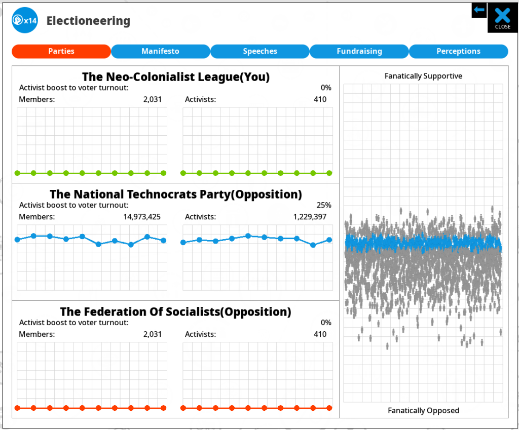
This represents approval as the Y axis (chart on the right btw…) and plots every single AI voter. Depending how distributed they are, the effect we describe may vary. In my nightmare 49/51% example, every voter is on the same horizontal line just moving up and down. In this case, the voters ARE very clumped, and just below the point of approval where they would vote for me, as this is a 3 party country, and they are tempted by the middle party. Right now, this is dreadful news for me, and awesome news for the middle (blue) party, but given the voters are so similar, if I can shift my policy positions closer to those the voter’s prefer, I should get an overwhelming avalanche of voters tilt my way!
This is also something you can see if selecting the ‘happiness distribution’ button on the ‘Everyone’ voter group. This time its represented on an X axis, where the left is 0 (angry) and the right is 100% (happy):
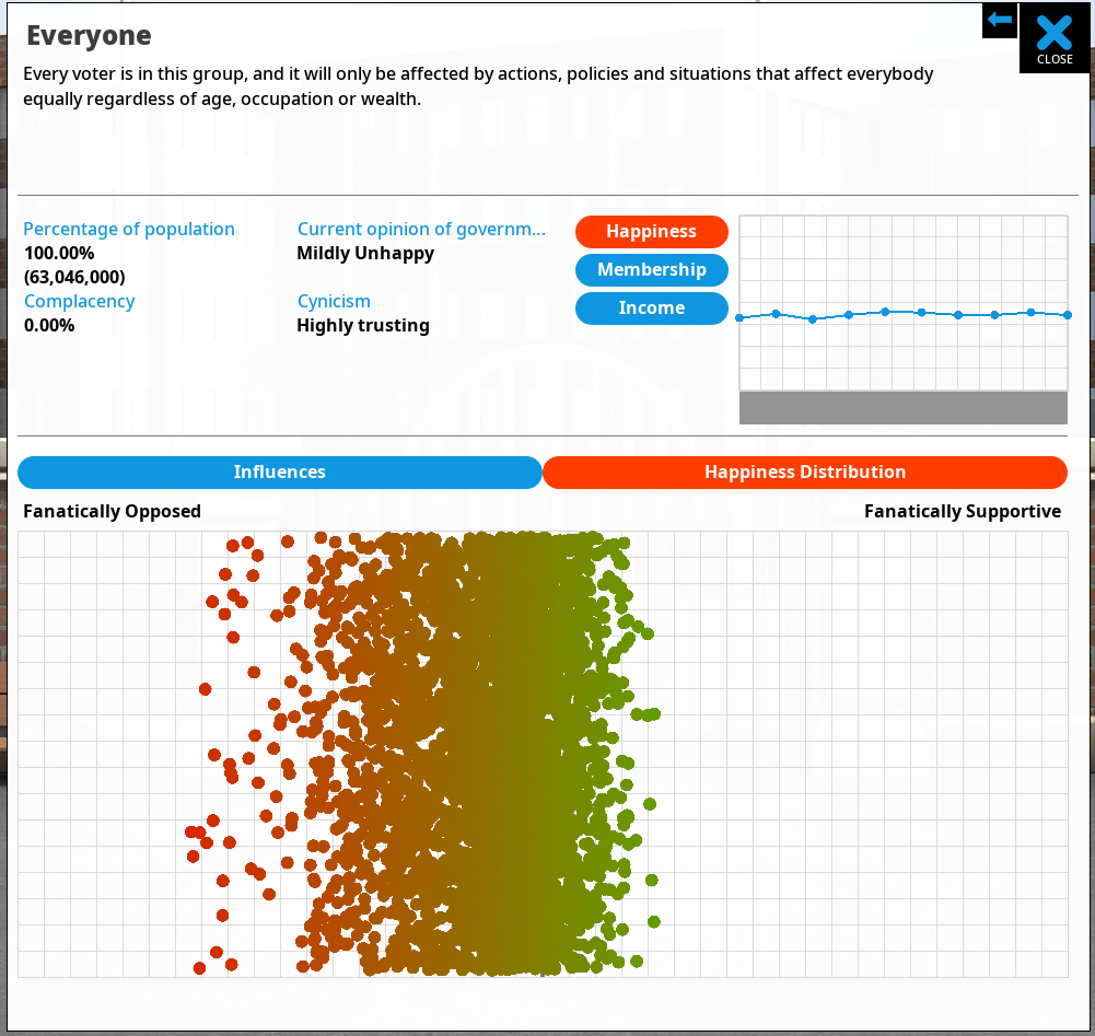
This is the same game, with the same voter distribution, and as you can see, in this case (start of game for the UK), its pretty clumpy. BTW the color of each dot represents happiness. Those green voters are happy, but they need to be super-green to vote for me, as there are 3 party options.
So all the information is kinda there, but people still don’t understand those wild swings in voting outcomes. As a result I have decided to try and represent it another way, in another position. I think that in general, players are expecting to get all their polling information from that earlier polling screen, so if I am going to represent voter approval distribution I need to do it there. PLUS, ideally I need to show it changing over time, not just a snapshot in time which is how its shown on these two graphs. Here is my current solution:
Same chart as before, but the background is now filled out with some extra information in the form of green blobs. These are presenting the voter approval distribution at each point in the game. The larger the blob, the more voters it represents. Over time, the blobs both move and change size, as the opinions of the electorate change.
The ideal situation for the player is to have substantial big green blobs way above the line, so they represent committed voters who are unlikely to suddenly drop below the line. If you have the green and blue lines above the threshold…BUT… there are large green blobs right on the line… then this represents fickle voters whose opinions might easily shift against you.
In code terms, each turn I’m asking each voter what their approval is, and sticking them in to one of 20 vertical ‘buckets’ of popularity. Each of these is a blob. Then in the chart I’m showing the number of people in each of those buckets by the size of the circle. Its more complex than it sounds because you need to work with circle areas, not radius, and also do some pre-processing to detect the largest blob, so you can then scale everything so the blobs are as large as possible (for legibility) while also being in proportion to each other and thus accurate.
The HUGE challenge is, as ever, not technical but UI/UX related. Does this help? does this make sense? and given that players often do not read tutorials, guides or walls of text, is it conveyed clearly enough just by the phrase ‘approval distribution’? Does the red approval line need its own key to explain what it is? (I think maybe so).
As always I’m interested to hear what people think. There is a complexity cost in adding this (it complicates this graph, potentially distressing newer and more casual players), and I need to be confident that the increased visual complexity is offset by the greater insight for the player into what is happening out there in opinion poll land…