I blogged very recently about adding voter approval distribution data to the polling screen in Democracy 4. This is going into the next game update, but I’ve changed it since then and thought I would explain why. The aim has been to give the player some insight into the actyual distribution of voters over the whole range of approval values, rather than giving just two numbers at any point in time (which in a 2 party system are the ‘average’ of all voter approval values, and the percentage of voters for whom their approval exceeds 50%).
For reasons discussed before, these numbers, while interesting give no insight as to whether your current support is soft or reliable, so they are imperfect information.
Consider an example. The player is 2 turns before an election, their approval is 60% and their voting intention is 85%. The player has a fairly socialist-leaning electorate, but they are trying to move towards capitalism, and one of the steps along their desired path to this, is to privatise state industries such as rail. They are trying to decide if they should go ahead and privatise rail right now.
In one scenario, their support is pretty solid. The voters approval is distributed pretty evenly across the spectrum. Obviously an approval drop across the board will result in everyone slipping down slightly, but enough voters sit really high in the distribution that the voting intention will happily stay at 70-75% even with a drop in average approval.
In another scenario, their support is super-soft. Basically almost all of the voters are in a single big blob of approval hovering around the 60% mark. The unpopular privatisation might shift that whole bubble low enough to actually drop voting intention below 50%, losing the election
Right now, the player could go check the parties screen with the chart on the right giving them clues about the distribution, or the ‘everyone’ happiness distribution, which shows the same thing, but the data was never present on the polling screen, and more relevantly, it was only ever shown as an instant snapshot. Here (below) is my final implementation on the polling screen.
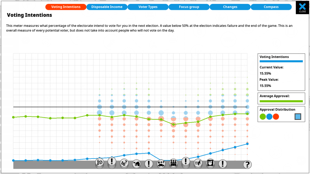
This is a new ‘optional’ view, thats turned off by default. (The checkbox to the right turns it on or off, and a tooltip over that area explains what it shows). This now shows the distribution (bubble sizes in the y axis) over time (the x axis, with the right being the present day).
I spent LOTS of time trying out different methods to show a bunch of stuff here. Initially I just had the background blobs, but they were all one color (feint green). I then realised that what was actually helpful here was to show what party the voters were going to vote for, so I added some feint red lines to show ‘voter thresholds’ for each party. This needs explaining:
In a 2 party system, the code is simple. Voters check their approval, and assuming no external factors (electioneering stuff, or party membership), they vote for the player if approval >50%, and for the opposition otherwise. In a 3 party system, there is a middle party, so you are looking for 60% approval to get their vote, with 40-60% approvals going to the middle party. However… its not quite that simple!
These thresholds MOVE over time. The game takes into account the fact that parties shift their position. This is the famous overton window, coded into party strategy. In short, if you are winning, the other parties move their (unstated and hidden for game purposes) positions in policy terms closer to your own. That means those 40% and 60% thresholds become more like 45% and 65%, or even closer. As you would expect, the reverse is also true. When you are doing badly, the opposition parties move further from you, so those thresholds can drop as well. This has been in the game for ages, but was not easily viewable by the player.
The chart above is actually fiendishly complex, because it displays a 2 axis chart with 2 lines showing different things over time (voting intention and average approval) and ALSO a backdrop that shows a four dimensional data set describing voter approval distribution and voting intention!
How come four dimensions? Firstly time (x axis) secondly approval (y axis), then the distribution of voters in each of 20 vertical groups to show the distribution of approval (size of each blob) and lastly the voting intentions within each blob (the colors of the blobs, or partial colors, indicating which party each voter would choose if the election happened that day.
No wonder its hard to get the GUI right :D
Anyway… it seems arcane, but it is actually all in the chart. You can see if you look closely that the point where voters switch from voting red, to voting blue, does not stay a fixed line over time, its actually changing in response to the popularity of my own party, which is based on the voters approval. (note this is a 3 party system, parties are red, blue and green, with green being the player).
If it sounds tricky to imagine as UI its even more annoying to code. I coded it as a sparse rendered system, instead of just generating, for example, 3 different colored circles for every x axis and y axis position. Even if you don’t draw them, that means 20x20x3 = 1,200 sprite objects being created, despite the fact that only a fraction will need ever drawing (most points on the chart have one single color circle, or are even unpopulated entirely.
Anyway, I think it adds some helpful extra data to the screen. I probably need to improve the tutorial/guides/in-game help at some point to explain it all though :(