Game Design, Programming and running a one-man games business…

Challenge UI for Ridiculous Space Battles

If you played the original Gratuitous Space Battles game about 500 years ago, you will recall that the online challenges were a very popular part of the game. If not, let me explain: GSB was the first autobattler, so its a game where you set up a fleet of space ships (that you designed), give them orders, and then use that fleet to defeat the enemy in a mission (which I called a skirmish) that was designed by me (the developer). HOWEVER, there was also the option to just design a fleet that you thought was a good all-rounder against all foes, and submit a ‘challenge’ to another player (or everyone) and let them fight against your fleet.

To do this, there was an online system where you logged in, and designed the fleet, typed a ‘taunt’ for your enemies, and submitted that challenge. It got stored on my server as a small text file, along with a small thumbnail preview image showing the fleet formation. Other players could browse available challenges, download them, and enjoy designing fleets to beat them. There were ratings system, message systems, and ability to view all of the fleets that were sent to battle against your fleet. It was so cool, and so popular, it crashed the server. The challenges were stored as individual files, and there was something silly like 500,000 of them (or more), and the whole back-end basically collapsed eventually!

So lets not let that happen this time eh? (hardly a risk, as I doubt this game will be as popular).

Anyway, I am re-coding the whole thing from scratch, like I have done for the whole of Ridiculous Space Battles, so it means completely re-thinking the UI, the UX, and the back-end code. The previous layout of the challenge browser looked like this:
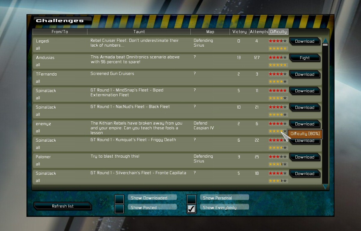
Which has not aged THAT badly, although it certainly does not fit the more clean and white-space loving UI of the new game. The original game went with an ‘industrial physical’ theme for the UI, and that feels very 1990s to me now. The new design currently looks like this:
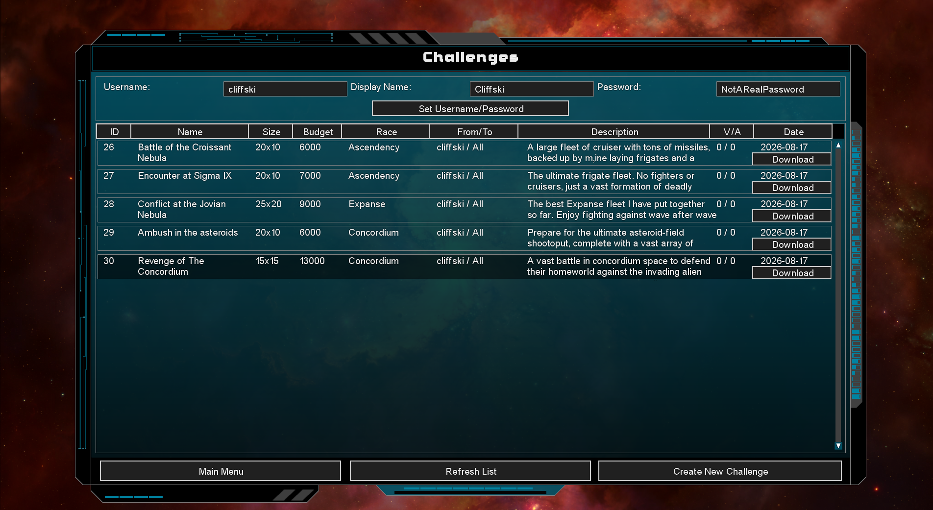
A bunch of stuff has changed. I am now listing the challenge ID, and also a title as well as a description. I do not have difficulties in there yet, or ratings for fun, but I might include that again. The big problem is getting the balance right between ‘I have a lot of information to display here’ and ‘do not look too cluttered’. This is something I struggle with a lot in design, because I feel like my tastes are the opposite of most web designers and game designers these days.

I am an autistic, numbers-obsessed data-loving geek who loves nothing more than a super-complicated dashboard of data. (Its a miracle I only worked on the software on trading floors and did not become a trader myself) This means I am pre-disposed to a data-rich UI layout. But these days its apparently ILLEGAL to update any software without saying its a ‘cleaner’ look, which means that the whitespace has gone from 90% of the layout to 95% of the layout. Absolutely every ‘designer’ seems to assume the only UI in the universe is a mobile phone, and the only customer is someone who is mentally incapable of seeing two pieces of information on a single screen. By Kahless I hate this trend… but anyway, nobody gets to tell me how to design my own game, so why do I care :D.

Anyway, there is a lot more to do. I have a different UI almost complete for actually submitting a challenge:
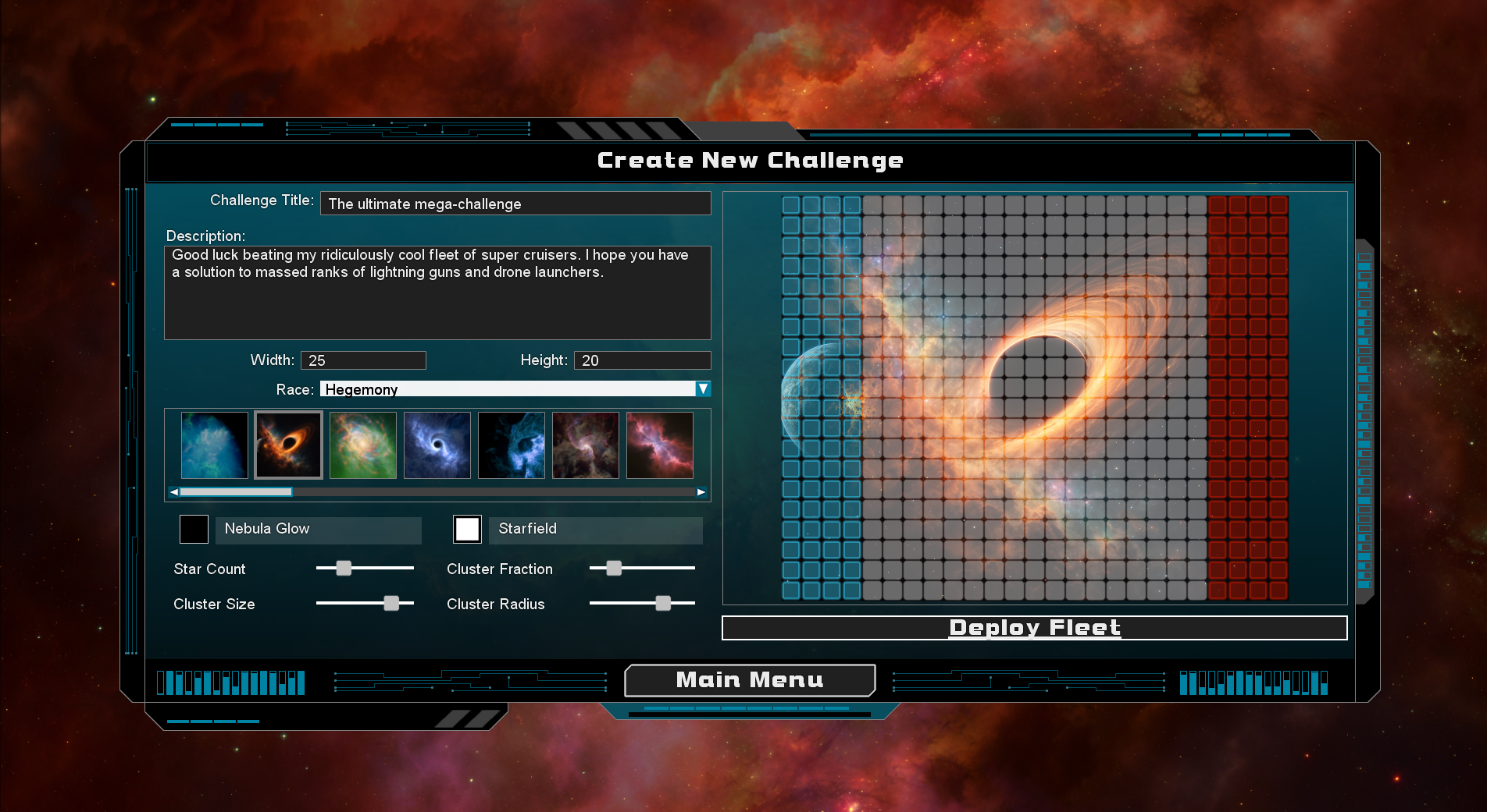
…but I still need to do the code that downloads the challenge from the browser, and then launches the deployment screen with it as a battle to be fought, and resolve all that at the end (Telling the challenge there was an attempt, and if it was a victory… logging what the attempting fleet was, etc). I also need to stress test everything, and set things up so you cannot create multiple users etc etc.

Doing all of that means writing a bunch of web client code (I use the WinInet win32 API) and also server code in PHP and SQL. This is where I have found working alongside Claude (Anthropic’s AI) has been great. I do NOT (yet) use ‘Claude Code’, but what I am doing (with a £15/month sub) is occasionally asking for Claude to write some php, or some SQL or an WinInet function for me, that I then read through and check. This, in my opinion is a great way to use AI to make you a more productive coder, without worrying that its doing random stuff. I use Claude very sparingly to write general C++, but for this part of the game, I’m using it a lot.

Why? Because frankly I do not enjoy SQL or PHP and am not an expert. I can code in C++ with my eyes closed (you would expect that after 29 years right?), but I have written very little php or SQL, and this stuff is web server stuff so its DANGEROUS. If I screw up the .exe, the game might crash, but screwing up database code and php could let someone hack the server and wipe things. I REALLY need expert help on the php/sql stuff, and Claude certainly seems to be amazing at this. FWIW I use Opus 4.8 (High) right now. Anyone who has used SQL will appreciate being able to say “Write me the correct SQL to do this…”.

Anyway… things are progressing! And I hope to actually have the game in a shippable (to Early Access) state around October at the latest. All I have left to do is this challenge stuff, then a bunch of ship designing and fleet designing for the levels and campaign (already done, but definitely need another pass), and a tutorial, and then its basically very playable. Early access will hopefully be a period of optimisation, any bug fixes, and responding to player suggestions about balance, gameplay tweaks and new features. I think I *am* just going to re-use the GSB2 music for this game, and all of the art is done, so I am not waiting for anybody else (and this is proudly a solo project anyway).

If you want to be notified when the game is finally released, you can add it to your steam wish-list using the widget below, or maybe bookmark (and share!) the games website link. Thanks :D.

Ridiculous Stats Battles

A while ago I re-designed the post-battle stats screen for Ridiculous Space Battles. I was MUCH happier with this than the earlier versions and I loved the horizontal histograms for every weapon which showed not just how much damage they did, but how much was reflected or absorbed by each of hull, armour and shields. I think it was a vast improvement on what I had previously. However! there was much room for improvement.

The biggest issue was that the list of stats chosen didn’t seem to be that helpful. If your fleet was 95% frigates, why bore you with the ‘best’ cruiser and fighter weapons? I re-designed the system to show you more interesting key stats such as the most cost-effective weapon, the ship that was hardest to damage (toughest?) and the weapons that were in use the most (or least). These stats are way more helpful:

Although that was a big improvement, play-testing showed me that a key problem still remained (which is true of all auto-batllers), which was namely ‘How can I translate what I learn from all these stats into adjusting my deployment the next time I fight this battle? This is a big problem (and it was back in the Gratuitous Space Battles days), and I have experimented a lot and come up with a solution I am super happy with!

In hindsight, the solution is obvious. Give the player a way to view want went wrong last time, when they try the level again. In code terms, this was a ton of work, but it works!

So when a battle ends, after viewing the current stats (probably best thought of as stats-highlights now), if you then want to try the level again you have a togglable overlay over the deployment map which shows the fleet you tried last time, with a ton of stats for every single squadron showing how they did.

The coloured squares and the percentages show survival rates for each squad, and you get Survived/Escaped/Destroyed percentages as a tooltip, but click on any squad to see a pop-up with a bunch more stats, tabbed into defensive and offensive data.

And at any point you can use a hotkey (or the buttons at the top of the screen) to toggle from this ‘previous battle overlay’ to your placed deployment for your next attempt at a battle. This makes it SO MUCH EASIER to look at your deployment and work out what went wrong and why, and correct it for the next battle. It is also persistent saved-to-disk data, so you can come back to a failed mission months later and still see the battle stats from your last attempt.

I know the games development keeps taking longer and longer but its definitely getting to be a lot better as a result, and I would rather ship a great game late than a not-as-great game on time. Thanks for your patience, and for following its development! Since I took that screenshot, I have had a MUCH better idea for how to make that screen even better, and I’m working on that now. This means even more work, but its going to be awesome.

Ridiculous Space Battles Progress

Ok so, I know this is probably not a big deal, or a new thing… but I have spent so long with this blog casually embedding youtube video links, that it took until today in 2026, and my desire to do what I can to de-couple my life as much as possible from US tech companies for me to discover that you can just natively embed an mp4 in wordpress! So anyway… I present the new race-selection screen animation effect in Ridiculous Space Battles!

and yes… before you comment, I know there is a bug with a texture changing wrongly when I scroll to the left. I’ll fix that tomorrow! I am however, pretty happy with this code, and this look. Coding stuff like this is harder than it looks, because to have everything seem smooth and crisp, you have to basically render all of those windows to an offscreen copy (with alpha) and then copy them as scaled sprites to the screen. That sounds simple, but its a lot of management, as you keep swapping render targets, and have to very smoothly transition from ‘offscreen pre-rendered sprite’ to proper rendered and full featured window.

Trust me, its a pain. It took a whole weekend. Well… it took all the hours I worked this weekend (which was not a lot TBH…). Anyway, that is one new thing that is in Ridiculous Space Battles. Another change was the re-colouring and some adjusting of the deployment screen to make it more user-friendly and less BRIGHT COLORS:

This definitely looks better. You can also see that the range indicators from my last blog post are in there with less angry colors too. The next big thing on my list is to balance the various weapons, and in fact before that, I need to code systems that really quickly run a lot of battles super-fast for me to gather stats. That will be a whole rabbit hole of code, but should be fun.

So to recap, the things left to do before early access or alpha-testing are to balance the modules, to put together the campaign fleets, to test the campaign, and to implement and test online challenges. No doubt lots of bug fixes and optimisation to do too, but I love the optimisation bit :D.

Deployment Range UI for Ridiculous Space Battles

I have been a bit quiet on the blog front, but in case you were wondering, yes I am definitely still working on Ridiculous Space Battles! Right now I am thinking about the ship and fleet design for the campaign game, and this is forcing me to think more about the usability of the deployment screen.

For a bit of a history lesson, here is the deployment screen from the original Gratuitous Space Battles:

There are so many things wrong with both the style and the layout I do not know where to begin, but given GSB was the first auto-battler, there was both no competition, and no other examples to be inspired by. Anyway, one of the many bad things about this UI is those circles around every turret on every ship that were supposed to show the player the weapon ranges, but in fact just look like a confused mess. Here is my current version of the same screen in Ridiculous Space Battles:

I think its so much better… but specifically I am working on the range and fire arc overlays. They only show for ship(s) that you have selected, and one of the changes I have made is to color code them as red for short range weapons, white for mid range, and green for long range. Like *anything* in game UI design, there is no perfect answer here. Red for short and green for long feels right, as long range is generally good (assuming everything else is equal). Making mid-range yellow might be a step too far in mirroring those order strips to the right, so I decided to go with white…argghh…who knows!

The problems arise a bit once you have a bigger battle and with multiple ships selected:

Now the red is showing the combined overlay of the short range fire arcs for all selected ship weapons. Be aware a ship might have 7 different weapons, and could be in a 4-ship or 25-ship squad… Its a complex thing to visualise, but its getting better!

In addition to fiddling with this overlay UI, I have also been improving the ‘ship role descriptions’ that are shown as tooltips for a ship design. I’m basically approaching the problem in 3 different directions. Select a ship…and the overlay should show you its weapon ranges on the map. Select a ship-type at the top-left, and then hover over a weapon name, and you get that big tooltip (see the one for ‘Plasma Stream’ above), which lists everything, including range. If the range is especially low or high, it gets a colour (red/green) highlight. Thats true for shield and armour penetration too…

The thirds method is the mouse-over tooltip for the ship types in the top left ‘ship-picker’. The game analyses all ship types and gives them various descriptive tags (I call them Roles in code). Those might be ‘Mixed Range Weapons’ or ‘Anti-Armor’ or ‘SuperWeapon’, or a bunch more.

My goal is to be able to help the player remember which ship design is which, so they are not just blindly spamming down a bunch of ships and hoping for the best. Ideally you have some short range ships serving as tanks at the front, absorbing enemy fire and shooting down incoming projectiles, then deeper ranks are mid-range and long range, or ships with shield support beams. Choosing the right formation and deployment should be a big part of the game.

Anyway, thats what I’m working on right now. The list of stuff to do before Early Access release does keep getting shorter (I think). Anyway, don’t forget you can wish-list the game at https://store.steampowered.com/app/3607230/Ridiculous_Space_Battles/