Game Design, Programming and running a one-man games business…

Mip-Map hell with Production Line

In a recent conversation with fellow indies about how I can make production line look better, someone effectively said ‘why are you not using mip maps’, and at first I laughed because, LOL, I use mip maps, and then I remembered that the geniuses at Microsoft decided that D3DXSaveSurfaceToFile should not generate mipmaps so actually…the game didn’t use them for many of its props (the stuff in texture atlases, basically).

So obviously I immediately thought what a dork, generated mip maps and…

it kinda looked way worse. Or did I? I have stared at the pixels so much now I am starting to see things. Here is the game as it currently looks (mip maps enabled in engine, but most of the car graphics and prop graphics not generated with any). (click to enlarge)

And here is it with mip maps enabled. (click to enlarge)

From a distance does it look any BETTER to you? I’m not sure I can really tell much of a difference until I zoom in. Here is evidence of how blocky the current one looks when zoomed in…

versus the mip-mapped one.

Which obviously looks better, but its not *that* simple, because the mip-mapping also creates some artifacts. here is a montage of the current, and lots of mip-mapped styles, with different settings from mip map creation filters, sharpening and softening etc. I just can get those door lines to vanish…

Which possibly means that I need to adjust how those cars are being drawn, or means I have not yet found the perfect set of render options for generating dds mip maps. There is also the possibility that the way I render out my car-component atlases (with a black background) is bleeding onto the mip maps at lower levels, and that this is where the problem is.

Of course all of this is absolutely *a matter of opinion* and thus really annoying, as I am a data-driven guy and like hard facts,. so stuff like this is where I fall down a bit. I don’t like pixellated graphics ( I despise the look of minecraft) but on the other hand I also REALLY hate over-blurred images, which make me think my eyesight is failing or I need new glasses. Its also very tempting to give in to the mistake of zooming in to a static image and declaring the best one to be the one where a zoomed in screenshot looks best, which is WRONG because obviously when zoomed right in, the mip maps are irrelevant anyway. here is the current (non mip mapped) car zoomed in.

Which leaves me in a bit of a quandary. Is it even worth continuing to fuss over this stuff…does anybody really notice/care? Or should that time be better spent on adding new features to the game?

The #1 metric for your indie game

People do not want to hear this. It will not be popular. There will be denial. I have spent a long time, in phases over the years, in denial about it. I have wanted to believe it was not true, because realizing the truth is often very depressing, and if you are like most passionate and committed indie devs, you associate a lot of your personal self-worth with the success of your game, and you absolutely do not want to hear what I’m about to type. You may disagree, you may REALLY disagree, and for all I know, I may be wrong, I’ve certainly been wrong many times, but I assure you that when I type this, it is absolutely what I believe to be the case right here, right now in 2019 making an indie game for the PC.

The #1 metric for your indie game, in terms of determining its success is how good it is.

There. I said it. Unleash the rage hordes.

There are a whole host of reasons why we may try to argue that this is not true. Maybe luck is the biggest factor (seriously? you can do better than that, especially as some developers,/studios then seem to be weirdly consistently lucky…), Maybe its marketing spend (definitely a factor, but not #1. what was minecraft and flappy birds marketing budget?), maybe its nepotism and who you know? (really? was notch super-connected? was he a regular at GDC parties before minecraft) Maybe its originality (seriously? is rimworld a huge hit because of the original art style?) Maybe its timing? (seriously? when did making a game about income taxes gel with the zeitgeist of gaming tastes then?)

Face facts, we WANT the reason for a games success or lack of success to be something OUTSIDE our control. We want it to be something that we can shake our fist at, and complain about to our friends down the pub. “My game would have been a huge hit, if only I was friends with Mike Bithell, or if I lived in San Francisco, or if I had a bigger art budget, or if I had released it a month/year/decade earlier/later.”

I’ve made loads of games. Seriously loads. Many more than people realize. have you tried Kombat Kars, Space Battle 3001 and Kudos: Rock Legend? Probably not, but I’m responsible for all of them. None of them did that well, and they all kind of suck. I did a game called Planetary Defense, which kinda did ok considering the super-short dev time. It was ok, but the gameplay was fairly shallow. Kudos:Rock legend couldn’t decide if it was serious or casual. Kombat kars was hampered by my total lack of understanding physics programming. Space battle 3001 looked like someones first space game, and played like it too.

There is an absolute art form, to which many devs acquire olympic style skills, to come up with reasons that your game failed. People could write whole books on all the various outside factors that were beyond their control, which meant that inexplicably their last game was not a success. Its quit impressive to see the mental gymnastics. The only factor that is never considered? The actual game. maybe the game is just not good enough. It might be good, but not good ENOUGH.

Its a topic for a whole blog post in itself to explain why if you game is 90% good enough you will get 10% of the sales, when its 95% good enough you get 20% of the sales and when it hits 100% you get 100% and buy a sports car. Just trust me, its true, I have long experience of each stage of that.

And now before you hurl abuse at me, I’ll explain the nuance of what I mean when I say ‘not good enough’. Its probably not polished. The gameplay is not balanced just right. The tutorial is not good enough. The player options are not comprehensive enough. There may not be enough content. The art style may clash. The sound effects may be annoying. The music may be too repetitive, or annoying. There may be big obvious missing features where players expected things to be in the game. There may not be enough tooltips or hotkeys. The translations may be of poor quality. The performance may suck for some players., and so on and so on…

Production Line was started over 3 years ago. about two years ago it was a good game I was very proud of. it got better and better during early access. it was released this year and I considered it to be a very good, polished, high quality game. It got extremely good reviews. I could easily have moved on, but I have not, and I’m still working on it every day. It is not good enough. It is very good, and has made a profit, and sold a lot of copies, but it is not good enough.

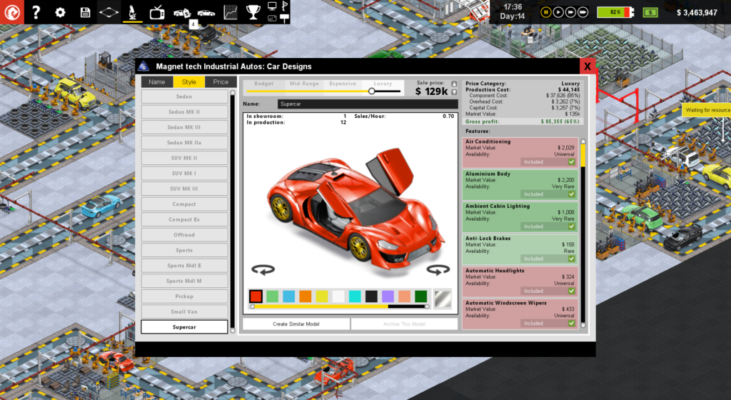
I’m on update 76 right now (started working on it today), which is based around changes to some charts and graphs that display data about the component import costs. This is a tiny part of a tiny part of the game, but I am aware that its a bit obscure and confusing and some players have said so. The games reviews are very positive and the vast, vast majority of players have no problem with those charts, or do not care, but some players think they suck, and dispassionately I agree. They need to be made better.

That wont be the last thing I improve or tweak. I’ll be working through my polish list for a long time. As I work more and more on the game, and finesse it more and more, the sales go UP not down (as is the curve with most indie games). I’m not awaiting the imminent demise of the games sales, but the absolute opposite. I’m 90% there and heading towards 100%. Quality is all that matters.

I know this isn’t an option for everyone because: experience & economics. Not everyone has 39 years of coding experience, not everyone has a financial cushion that allows them to spend a bit longer to make a game higher quality. I know this. I know the position I am in, very acutely. The reason for this blog post is not to criticize but inspire. I want people who are struggling as indie devs to do well, and I feel thats best achieved by pointing out the truth.

We all lie about ourselves, even to ourselves. I think I am much funnier and better looking than I really am. I also think I’m thinner than I am, and probably kid myself I have some hair. We also lie about stuff we do, and stuff we make. The problem is, when your own sense of self-worth and your own pride get in the way of seeing reality, you are doing nobody any favors. Your indie game is probably not good enough, and deep down, you know it.

Making the Production Line supercar expansion

So unless you have not heard, i’m making an expansion pack for my car factory game ‘Production Line‘ which adds a new car type (supercar) and also some new door options as features for various car models, and those door types are Scissor-wing doors, Gull-wing doors and butterfly doors. I’ve done a video that shows these off (below) and also we have a web page for the dlc that you can find here.

I thought I’d put down in writing how this came about and why this was the DLC I decided to do. Personally I’m a fan of DLC, but only if its actually ‘adding’ to the game, or giving the player options, rather than just tweaking some numbers and selling a few text files for $5.99. That seems a bit exploitative, so I always focus on doing DLC where we have new art content at the very least. There is a LOT of art that goes into a single car body design in Production Line, because every car is completely different in terms of where the wheels are, what the headlights look like, even what the axles and drive shaft looks like and where they go. Nothing currently gets simply re-used between body styles.

Adding a super-high end car to the game makes sense from a design and balance point of view, because it means we can leave the balance of the existing game in place, and effectively just add a new style option for the luxury cars, and add a tiny section of the public who only want to buy a super-car shaped vehicle. In the real world, most sales at that price point already are accounted for by people buying sedan and sports style bodies, but there are some people who would want to spend the same budget on a car with a crazy shape.

Plus crazy designed cars are cool right?

Once I knew we wanted a supercar, having crazy doors is pretty much a no-brainer. people love cars with mad doors, and some research showed that butterfly, gull and scissor were the most common options on modern real world supercars. In theory putting all this in the game was going to be mostly artwork, and then some balancing by me. pretty easy huh?

It turns out..NO! This was extremely tricky because of the way the design of those doors overlaps other parts of the car when they are open (which involved a lot of re-ordering of existing components), and the nightmarish fact that gull wing doors actually require a different ‘roof’, to allow for the cutouts n the side for the door hinges. This means I had to redefine these door ‘styles’ as roof types, which also ensures you cant have gull-wing doors and a panoramic sunroof…

As a result, door styles have to be like drive-trains: set in stone when the car chassis is first created and unchanged for the lifetime of that existing chunk of metal. In game-terms, this means that switching your luxury sedan to use gull wing doors will not have any visible effect for a while, as the cars right at the start of the line are then set to be gull-wing, but they have to get all the way to the door panel slot for you to notice.

This also involved a huge amount of special case code-spaghetti, because if you have gull wing doors, then certain other things change. You cannot stick normal windows or wing mirrors on a gull-wing door, and so-on. There was quite a bit of complexity involved in swapping some components for others to accommodate the new system.

I like to give my artists total freedom to create cool stuff and tell them I will worry about making it work. I get better art that way, but more work for me… It turns out that yes…its very cool that the supercar’s engine is behind the driver, but that caused me some hassle to ensure that when the engine gets fitted, its the back part of the car (trunk) that opens up to have it fitted, and not the front… (99% of players wont notice, but I like to surprise the 1% who do). As we were doing this anyway, it made sense to support the same capability for the sports cars, which also look like they have the engine in the back.

So all of that stuff is now DONE and tested and working in the game. The installer is done, and I’m working on the steam build, and mod-panel integration. All I need to do before release is keep testing the balance of this stuff to ensure that the doors are expensive and awkward to fit (but not unprofitable or too annoying) and that demand for these features and for the supercar makes sense.

Right now, the game is being tested with supercar sales only taking place in the luxury price band (well yeah…) and with a market size of 4.76%. I think thats maybe a bit high, and obviously in the real world its <1% but this is a game and needs to be fun :D

In terms of balancing the doors, they are currently just ordinary door panels..BUT the slot-upgrades are pretty expensive ($195,000 for a slot upgrade for scissor doors compared with just $3,480 for central locking) and they require sensors and servos, which lead to a bit of a bottleneck (intentionally). Plus the actual fitting time to add those doors is considerable, more than doubling the max-optimized time to fit ordinary door panels.

The final piece in the puzzle is the design cost. All door types need to be researched separately and also you need to research the new supercar body style. These are quite lengthy research items, but there is nothing stopping you skipping all the other car bodies and making supercars or gull wing doors your early game priority!

If you like the sound of all this stuff you can wishlist the DLC using the widget below.

If you are a youtuber looking to cover the game and want to make a key request you can get in touch through keymailer (below) or email me your steam curator name.

Production Line updated to 1.61 on the steam ‘unstable’ build

Lots of cool stuff in this update to Production Line, which will get further checks, tweaks and balancing before I roll it out to the main Early Access steam branch, GoG and Humble widget customers. Here is a list of all the features, and notes on the biggies:

[version 1.61]
1) [Feature] Loans can now be re-paid early, assuming you have the funds, at a penalty of 12 hours interest.

This was widely requested, and I kept putting it off because I felt that it would lead to an unbalancing in the games difficulty, but actually now I’ve tested it for a while I think I’ve got it about right and am glad its in there.

2) [GFX] Conveyors use less obtrusive graphics
3) [GUI] New screen for market analysis to show breakdown of demand, production and sales.

I find this new screen really helpful when playing the game towards the later stages when there is a lot to keep an eye on. I worry its not immediately obvious how it works, but I do think its a usability improvement for managing supply and demand.

4) [Content] New researchable upgrade & feature: large touchscreen.

To make it obvious some cars are tesla-level expensive, and some are more Ford Ka level… :D

5) [GUI] Vehicle design screen now hides categories entirely if there is only a single default option.
6) [Bug] Fixed design research queue bugs where you could adjust first and last items up and down, causing a crash.
7) [Bug] Fixed bug where the second-nearest import bay for each stockpile was sometimes calculated wrong, meaning inefficient routing. Also major route calculation speedup.
8) [Balance] Major increases in the cost and value of electric car batteries (large and small) and touchscreens.
9) [Balance] Increased the power draw and process time for making wheels.
10) [Content] New researchable feature: parking sensors. Now a pre-requisite before reversing camera. Fitted at bumpers.

Amazing we went so far without these, as they are getting so common now. Also handy to be able to add a new feature without requiring yet another resource as ‘sensor’ is already in there. Plus it gives some much needed upgrades to the bumper slots.

11) [GUI] Revamp of the ‘apply options’ screen post-research, which adds price category indicators and selective coloring, and new buttons to apply a feature to a whole category at once.

This makes things much quicker when you have 20+ designs, and you don’t really want to make a more nuanced decision other than ‘add this new widget to my expensive ranges’.

12) [GUI] Music and cruise control are now feature-categories, where the more expensive versions include the resources, value and features of the cheaper ones.
13) [Content] Self-driving! new researchable tech, new resources and feature category for high-end cars.

This is very late-game stuff and requires quite a bit of research, but then you should have expended your factory enough to have a good dozen or two dozen research facilities at this point.

14) [Balance] Boosted the impact on marketing campaigns on showroom visits by 25% to increase total market size possible with current campaigns.
15) [Bug] Fixed bug where sometimes the warning on the design screen about common or universal features missing would be skipped if the feature had a category.
16) [Bug] Fixed bug where changing the color of a car design could lead to duplicating the price slider GUI.
17) [Bug] Fixed bug where the correct price-category adjusted market value of a feature was not being displayed in a number of places.
18) [GUI] Double clicking a car in the showroom now launches the vehicle design screen for that car’s design.
19) [Content] New researchable vehicle body style -> The small van.

I’m so pleased we got this in. Its likely the last new body style,  and its a really cool one :D

Feedback on this new update is very welcome, and of course any bug reports for things I have no doubt stupidly managed to break with this patch…


Improving the charts in Production Line

Although obviously a tycoon/sim game like Production Line *does* need some fancy graphics, a decent overall design idea (‘Run your own car factory!) and a fair amount of content, in the long term, to get players to really put in the hours, the quality of the game can come down to two basic things:

  1. Is the simulation nicely balanced to provide an ongoing challenge
  2. Does the player easily have simple, clear access to all the information they need?

These are the things that I struggle with, because I know how vital they are, and yet other than measuring the games retention, they are very very hard to measure to see if you are making improvements on a day to day basis. I can easily add another car body or some more achievements or some more maps, and quantify the change, but if I redesign one of the stats screen, do I *know* that made things better?

So this results in a lot of chin-stroking and thinking, and reading books on user interface design, and of course a lot of playing the game. The screen that I have recently agonized over is this one:

Thats actually the ‘simplified version, that takes it for granted you can tell what those little $ symbols mean (price range) and recognize the car body styles enough to tell sedan from compact, from SUV etc. That frees us some space so its not impossibly text heavy, but frankly its still a mess. The red areas are ones where we are not currently selling a car to that segment, and each block is a combination of a car body style and a price bracket. All the data in each block is self explanatory (I hope), but although all the *data* is there, being able to rapidly draw conclusions from it is really hard. I guess the spread of green to red gives you a very rough approximation of how much of the market you have ‘covered’, but is that really accurate given that compacts and sedans vastly outsell offroad vehicles, and in this layout, all car body styles have equal prominence?

This is my current attempt at a solution:

This ‘pie chart within a pie chart’ shows the breakdown of total customers visits to your store (not the wider market, which is accessed through more marketing…) and shows the extent to which you produced enough cars to satisfy all those customers in each price bracket. The different body styles have been assigned colors, and those colors are split into light/dark gradients to show the four price brackets within each body style. To ensure that is apparent, icons at the edges of each segment show the price range symbols for that segment. Because the segments are correctly sized for the number of customers, its much easier to see where the majority of the market is, and no longer do you confuse the relative sizes of the off-road and sedan market (for example). It also makes it clearer that in general the expensive and luxury markets are smaller than the others. Unresearched body styles are greyed out entirely.

Here is an example with all body styles researched:

The inner chunks that are more darkly coloured are used to show the percentage of that market segment you have produced cars for. So if you get 8 customers per hour for a certain body style / p[rice combo, and you produce 4 cars of that type (of whatever designs), then that segment will be drawn ‘half full’.

So far that sounds good, but there are three problems I am yet to resolve.

  1. When you produce too many cars (produce 9 when there are only 8 customers) that information is not shown.
  2. This shows car production but not sales. maybe I produce a car for each customer, but they are too expensive to sell to them?
  3. The player may confuse the relative shaded AREA rather than the radius of the inner chunk as being the relevant metric.

Almost all of this is clarified by the mouseover tooltip which explains everything, but thats a clunky fix. I’m thinking of adding an extra red ‘bleed’ segment at the circumference to illustrate any cases where there is overproduction. I’m also considering having selectable buttons at the top to toggle between this chart showing production and then sales, as they are obviously different stats.

Still… I think its certainly a helpful addition. If you want to see the current version of this chart in action, I just uploaded a new blog video with it in today: