Although obviously a tycoon/sim game like Production Line *does* need some fancy graphics, a decent overall design idea (‘Run your own car factory!) and a fair amount of content, in the long term, to get players to really put in the hours, the quality of the game can come down to two basic things:
- Is the simulation nicely balanced to provide an ongoing challenge
- Does the player easily have simple, clear access to all the information they need?
These are the things that I struggle with, because I know how vital they are, and yet other than measuring the games retention, they are very very hard to measure to see if you are making improvements on a day to day basis. I can easily add another car body or some more achievements or some more maps, and quantify the change, but if I redesign one of the stats screen, do I *know* that made things better?
So this results in a lot of chin-stroking and thinking, and reading books on user interface design, and of course a lot of playing the game. The screen that I have recently agonized over is this one:
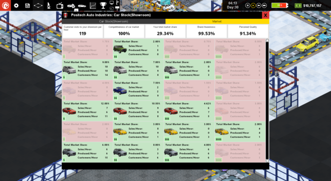
Thats actually the ‘simplified version, that takes it for granted you can tell what those little $ symbols mean (price range) and recognize the car body styles enough to tell sedan from compact, from SUV etc. That frees us some space so its not impossibly text heavy, but frankly its still a mess. The red areas are ones where we are not currently selling a car to that segment, and each block is a combination of a car body style and a price bracket. All the data in each block is self explanatory (I hope), but although all the *data* is there, being able to rapidly draw conclusions from it is really hard. I guess the spread of green to red gives you a very rough approximation of how much of the market you have ‘covered’, but is that really accurate given that compacts and sedans vastly outsell offroad vehicles, and in this layout, all car body styles have equal prominence?
This is my current attempt at a solution:
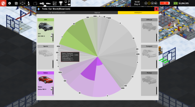
This ‘pie chart within a pie chart’ shows the breakdown of total customers visits to your store (not the wider market, which is accessed through more marketing…) and shows the extent to which you produced enough cars to satisfy all those customers in each price bracket. The different body styles have been assigned colors, and those colors are split into light/dark gradients to show the four price brackets within each body style. To ensure that is apparent, icons at the edges of each segment show the price range symbols for that segment. Because the segments are correctly sized for the number of customers, its much easier to see where the majority of the market is, and no longer do you confuse the relative sizes of the off-road and sedan market (for example). It also makes it clearer that in general the expensive and luxury markets are smaller than the others. Unresearched body styles are greyed out entirely.
Here is an example with all body styles researched:
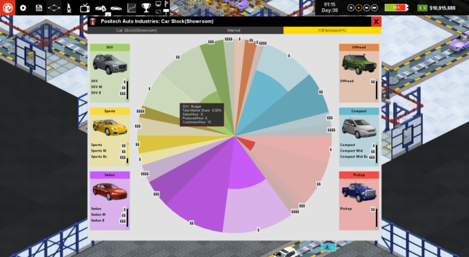
The inner chunks that are more darkly coloured are used to show the percentage of that market segment you have produced cars for. So if you get 8 customers per hour for a certain body style / p[rice combo, and you produce 4 cars of that type (of whatever designs), then that segment will be drawn ‘half full’.
So far that sounds good, but there are three problems I am yet to resolve.
- When you produce too many cars (produce 9 when there are only 8 customers) that information is not shown.
- This shows car production but not sales. maybe I produce a car for each customer, but they are too expensive to sell to them?
- The player may confuse the relative shaded AREA rather than the radius of the inner chunk as being the relevant metric.
Almost all of this is clarified by the mouseover tooltip which explains everything, but thats a clunky fix. I’m thinking of adding an extra red ‘bleed’ segment at the circumference to illustrate any cases where there is overproduction. I’m also considering having selectable buttons at the top to toggle between this chart showing production and then sales, as they are obviously different stats.
Still… I think its certainly a helpful addition. If you want to see the current version of this chart in action, I just uploaded a new blog video with it in today: