Game Design, Programming and running a one-man games business…

Visualising party membership & loyalty

Here is a screenshot from democracy 4 that I am not happy with, and I’ll explain why:

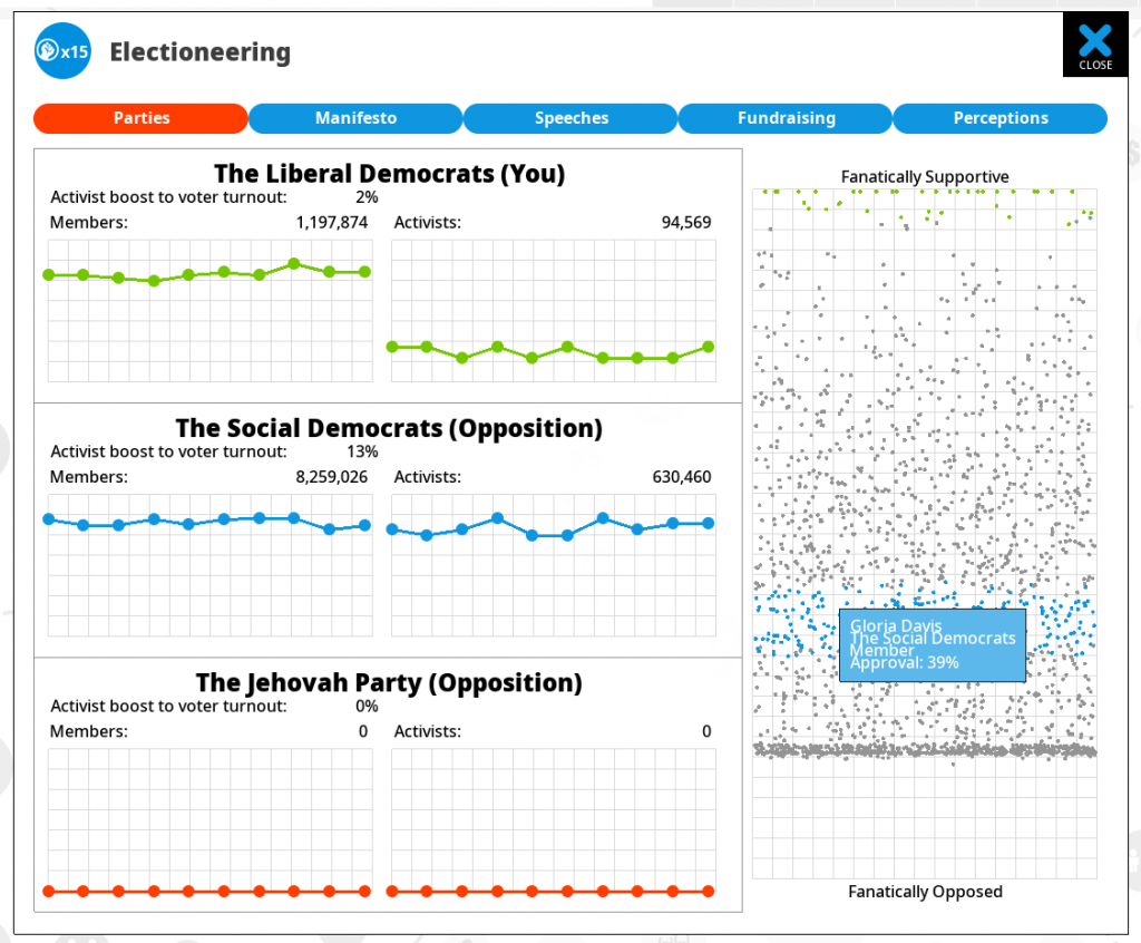
This is the parties screen in a 3-party game, and shows details of each party. The data presented is members, activist (real dedicated members who help get-out the vote, and then a scatter graph showing ‘approval of the party’ by every voter showing how close or far away they are from becoming members.

That third chart is the one I added today, and am thinking it kinda sucks. Its supposed to help the player understand fluctuations in party membership by giving them more than the ‘binary’ data of whether a voter is a member or not. This is because in the real world, people can be moderate members (they joined once, but don’t read the newsletter, and don’t get involved beyond just paying membership fees), right up to passionate members who become activists, hand out leaflets, attend rallies, and volunteer to help with fundraising and phone-banking.

The distinction is important, because you can have a party filled with extreme loyalists (unlikely to quit if you upset them a bit) or with moderate ‘soft membership’, where they are already disillusioned and the slightest policy shift will cause a collapse in membership.

BTW party membership matters because membership raise funds (used in campaigning), and members ALWAYS vote, regardless of usual turnout figures.

The problem is, I don’t think those charts make much sense to anybody who didn’t code the game… They shows party ‘approval’ on the Y axis (the X axis is random plotting), and approval depends on how close the voters opinions are to the parties position, and how close it has been over a period of time. This is complex and vague.

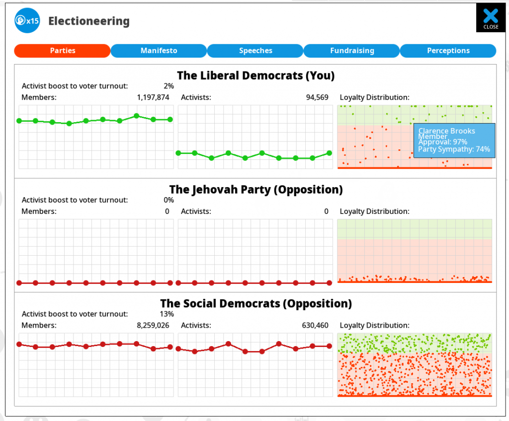
I think I might replace it with a single, taller graph that works differently and shows the range of approvals from zero (I HATE the government) to 1 (I LOVE the government), and plots everyone on that axis. We already have that (in a different axis) for the popularity analysis on the ‘everyone’ screen:

So I can do that but tilted anticlockwise 90 degrees. How does this help? Here is my magic idea:

I give each party a color (green, red blue) and I use those 3 colors to colorize the dots for each voter, showing how close they are to each parties platform. Voters who are members get colorised, others just get plotted in grey. I think this will work tons better, and it will make more sense… maybe. I’ll try it and post it tomorrow.

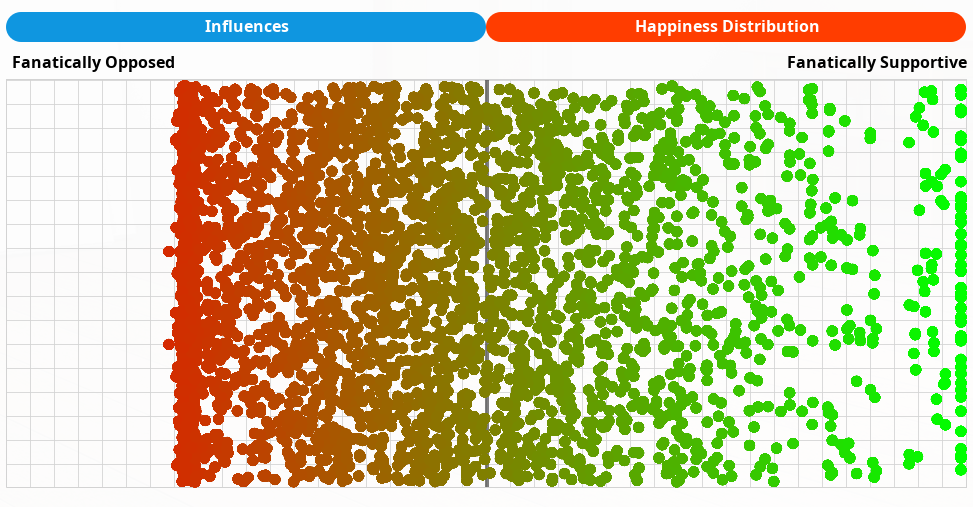
Ok…I couldnt stop and eat until i tried it. I think its better (needs some formatting tweaks)… thoughts…?


8 thoughts on Visualising party membership & loyalty

  1. Have you considered a histogram? Buckets of 0-10%, …, 90-100% on the x axis, number of people in that bucket on the y axis.

  2. My go-to for an easy-to-grasp visualisation of distributions are beeswarm plots. Similar in intent to your randomised plot, but the clustering gives a sense of the lumpiness of the distribution

    Here’s an example (not built by me): https://bl.ocks.org/sandravizmad/9fa1dbf097e032b344d8aa9b54adc8ed/e6286664b6d643b3954f3df6478d7395a0ade377

    They have the downside of not being able to show as many points (I normally do a sample of a couple of thousand or aggregate to a percentage) and there’s more overhead for computing the layout, but the upside is they animate really nicely over a time period. E.g. Showing how your parties have changed over time.

    Another thought I had was that instead of grey for members, you could do a lighter / less saturated version of the activist colour for each party.

    1. Yes indeed. Its funny you mention that as I was debugging this today. It turns out that the ‘floor’ of support for voters was due to the effects of campaign funding and campaigning skills by popular ministers. In other words, people saw so many party-billboards and the cabinet were so photogenic and charismatic that nobody really *hated* you..

      This felt unrealistic…

      So I added new code (that fixes this perfectly, according to my tests), where there is a threshold below which the effects of this stuff wears off, down to zero. So somebody whose base approval of the government is 0% will remain 0%, regardless of campaigning or the cabinets speaking skills, or perceptions of the president in the media…
      Someone whose approval is 12.5% will be only half-as-affected by these things as a normal voter, and so on (the new threshold for this affecting someone is 25% approval).

  3. Hello, I’m being off-topic here, but have you given up on webp or is there a reason you’re using png’s here? The pictures in that post take a few seconds to load for me.

    1. You are not off topic at all. I’m just an idiot who forgot his own advice :D. I’m not sure if wordpress has an ability to seamlessly support both, but it REALLY should do. My main website has some webps on there.

  4. Couple of points
    – This would look excellent if it was animated, so you could see voters migrating around over time.
    – Colour’s a bad way single of distinguishing between groups, as it’s invisible if you’re colour blind. Different shapes (as well) might help there.

Comments are currently closed.