There are a lot of games on steam. Those games are also cheap, PLUS steam has a refund policy. As a result, gamers don’t have to be patient. To be blunt…if gamers get confused or frustrated playing my game(s), they can refund them, or forget about them, and play something else. This is so different from when I was a kid, games were EXPENSIVE, there were far fewer of them, and you had to sit there and try things until stuff made sense. If you were really lucky, there might be a manual. These days, even if there is a series of explanatory videos, an illustrated manual, pop-up tooltips and an in-game tutorial, most players will ignore ALL of that, and just try to wing it. If things don’t make sense… your game is toast, your review score drops, your refund rate goes up, your sales go down, and you find yourself practising ‘do you want fries with that’ in the mirror ready for your next career move.
Obviously this is suboptimal.
I make innovative and fun games that have historically been a bit confusing to play and a bit buggy. This is the year where I try to address my game production shortcomings. Early Access is a godsend to me, as is collecting metrics on gameplay usage (anonymously). I can tell when people do not use a feature, and collect a lot of opinions from people on what sucks, and what needs work. I’ve made real progress in the last few weeks on reducing the bug count in Production Line, and I know I have a fair bit of work to do when it comes to the GUI and the ease with which players understand the game mechanics. In short, I need to give some more thought to a lot of my first-pass GUI choices.
A few screenshots illustrate a ton of minor things I need to give some thought to. Take this example:
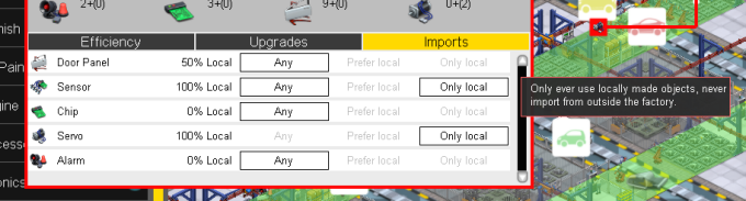
Theoretically thats a fairly obvious and simple piece of UI that shows you information on the imports to a production slot in the game. The player uses this tab to adjust where those imports come from, presuming they have researched the tech that allows such configuration to be made. Each line shows a different resource item that comes in, the percentage of the last 100 items to be used that were locally produced (within this factory) and 3 mutually exclusive buttons to set the import mode for that resource.
There are potentially loads of issues here. The game tracks the last 100 items used by this slot, but if 90 of them (in this case) were Door Panels and only 10 were Chips, then the sample size for chips is way lower, and the ‘local’ percentage is not as accurate or granular. Does this matter? Does the player know what ‘local’ means? should there be a tooltip for that part of the GUI (there is for the buttons, but the player may not hover-over those). This entire tab is also hidden (grayed out at the tab button level) if the player has not researched the tech. Should they still be able to see the local percentage in this case? or are we fine hiding that from the player until then?
Then we have those selectable buttons. Firstly, do they look like they are clickable? They change the cursor and highlight on mouse over, is that enough? And is it obvious they are exclusive to each other? they don’t ‘look’ like conventional radio buttons used in multiple-selection. Should I change the UI? Finally, whats with the text? it explains things but isn’t it a bit clunky? Should I have column headers with text and then just radio buttons with green check buttons to illustrate selection on each line? would that make more sense? Does all this text even fit in German?
Lets take another look at the same bit of UI in a different circumstance:
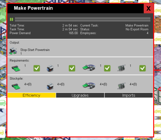
In this case, the entire efficiency tab, which normally contains a pie chart, is completely blank. Why? because nothing has actually happened in the last X seconds of game time, meaning that there is no data to display here. However, this is surely a GUI bug, we should be drawing a pie chart anyway and showing the last state the slot was in surely? Thats easily fixed… Meanwhile the entire slot is effectively paused, because the stockpile is FULL, and there is no room to export more product. Effectively, we are on hold due to a lack of component usage or storage elsewhere in the factory. The ONLY clue to this is the ‘Status: No export room’ text. This is woeful. The immediate state of the slot is not even that obvious to ME.
Possibly I should highlight that status in red, or have it flashing, or maybe both. Perhaps the grey progress bars should be red, or flashing?
While I’m at it, on the stockpile strip, those numbers show the currently in stock value PLUS the number of requested items currently en-route in brackets. Nowhere is this explained. Can I explain it easily in the space provided? I shouldn’t make those icons any smaller, but maybe instead of numbers I should just have 16 slots for icons and a different color or shape to show which ones are en-route? Would that make more sense? would it be visually cluttered?
There are no trivial answers to any of these questions, they all need some careful thought and experimentation. I may end up changing all of this, or none of it. Maybe some of my ideas would make things worse…its hard to tell without trying. the really painful thing is that the end user who buys the final game post-release wont see any of this. They will see a GUI layout of a window with some text and icons and think that it all sprang into existence fully formed. It really isn’t like that. To get the level of UI polish I want (and need) I’m going to have to iterate on this stuff a lot. This is tricky when you are the only programmer, and only designer. There is much to do…