Game Design, Programming and running a one-man games business…

New chart feature for democracy 3

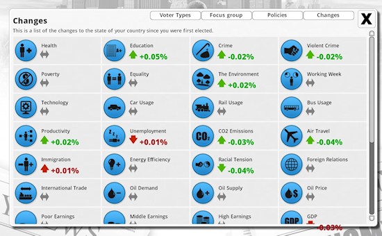
I added a brand new feature to democracy 3 today. I know it probably seems a little late to be doing that, but it’s a visual, not a sim feature. It’s a new chart which tracks the initial values of everything when you first took office, and lets you at a glance see how you have made things better/worse since you took power. Spot the accidental text-overspill bug!

changes

I added this because I found myself wishing it was in there as I play tested,. which is always a good reason to add a feature.

In other news, Gratuitous Space Battles is now dropping trading cards on Steam for steam players. Personally I don’t ‘get’ the appeal, but most people do, so who am I to argue eh? In other news, I am adding the USA to Democracy 3 starting today. I had to mod in a bunch of modifiers already. You Americans are less prone to outbreaks of socialism and class warfare and strikes than us Europeans, possibly due to the whole cold-war / McCarthyism thing. You are also a tad more religious, and sadly a bit more prone to drug addiction. A lot of drug production in the nearby south won’t help I guess. You are also a bit more obese, which I’m guessing is due to never having war time rationing?

mccarthy

Obviously these are huge embarrassingly broad generalizations. Such is gaming. Think of it as the reverse of the ‘cheese-eating surrender monkeyness’ of us Europeans :D

I am gradually working towards a more general press-preview build of Democracy 3, and the date at which I approach online portals. This is all mixed in with so much other stuff I’m tired just thinking about it. I need sleeeeeeepppppppp.


17 thoughts on New chart feature for democracy 3

  1. This is the first time I’ve heard of the trading cards, but I find myself wanting them…

    I’m liking that new chart feature, though the up/down facing of the arrows seems a little random. For example, the CO2 emissions and violent crime arrows point up when the relevant stat goes down, but the racial tension arrow points down.

    A couple of the stats might be a little sticky with regard to green/red as well. For example, is increased immigration always (and objectively) a bad thing? For example, we imported people by the shipload during war time because we didn’t have enough people left in the country to get everything done.

  2. I agree with pretty much everything Kemp says. A green upward arrow next to ‘crime’ does look wrong. Other issues where I’m not sure green/red is/would be appropriate would be things like the travel options.

    Similar to immigration, in your example air travel is down and that’s ‘good’ (presumably because of the environmental impact). But air travel is also closely linked to the current GDP, and a drop in air travel is as likely to be caused by a poorly performing economy as any actual measures to curb air travel, which would be pretty bad. The problem with saying air travel being good or bad (as apposed to, say, crime) is that it is very indirect measure. Falling air travel might be good, it might be bad, (or indeed both) and further context is needed to say for sure.

    It’s not shown in your screenshot, but others I would be careful of would be things like internet usage. I tend to see this as a pretty positive thing in Democracy 2 because it leads to higher productivity. However, there are options to legislate to restrict internet usage. As such, it might be inappropriate to suggest that it’s always good to have increased internet usage because it would suggest that the policy to restrict is wrong (and if that’s the case, why is it an option?)

    The working week may be another, similar example. A drop might caused by labour laws and be favoured by trade unionists and be good for that reason, but it might be caused by unemployment, which would be bad. For various reasons, you may be seeking to raise or lower it at any given time, so saying that it’s going up is good/bad isn’t really appropriate.

  3. Yup very good points, I need to tweak this feature to only use red/green where it is really clear, and fix all the inconsistencies :D

  4. Great feature and… to begin, a great idea. All real governments should have one of those charts, just for them to have a more often look at their successes failures.

  5. hah, that is a good point, although of course governments can always blame, to quote a famous British PM (macmillan) “Events dear boy…Events”

  6. Have to agree with the others about the green/red thing. All of these factors can go up and down. Deciding that one of those is good, and the other bad, is a value judgement.

    Eg. Unemployment up – excellent, keeps wages down, good for my business
    Immigration up – excellent, keeps wages down, good for my business
    Crime up – excellent, good for my prison business
    Air travel up – excellent, good for my airline business, sign of a flourishing economy

  7. indeed. Leaving it all dark grey would be a bit bland though. I wonder if I should swap to just green means up, red means down?

  8. I would be cautious about that. If you want to use one colour for up and another for down without regard to good or bad, I suggest using blue and orange or something. The colours green and red are too ingrained as good and bad.

    I think a green upward arrow and text next to something that is basically just bad (at least as far as the government is concerned) like crime or poverty would be confusing. It would make me wonder if the aim was to maximize everything, and that a high crime stat actually indicated things were crime-free.

  9. I agree with comments about the red and green thing- but I really agree with this new chart. It will be easily to review your record and how policies are impacting upon such things and it is something I asked for a while back so thanks and well done.

  10. Quick question- will these changes be reflective of since you took office or for each term. If you are in office for 20 years will it be for that whole period, or will it look at each term seperately? I would prefer the time you are in office because you can then evaluate your whole period in office and the difference your government has made.

  11. It’s definitely set for since you first took office, I agree that this is a much more satisfying way to review the stats :D

  12. My theory on the obesity:

    1) Corn subsidies lead to cheap processed food
    2) income inequality makes the processed food all that can be afforded
    3) Spread-out population= less public transport= less exercise.

    I don’t think rationing had much to do with it, as Americans did have rationing in WWII, just for a much shorter timeframe. My mom said she had rationing until the 50s, and she only gained weight when she started to live in America for a good while.

  13. offtop:
    Are you consider to open pre-purchase for Democracy 3 and give a beta for those who paid? I suppose it will be very helpful beta-testing for such complex game.

  14. I would like an option to choose whether a statistic is positive or negative, which decides the colouring of the arrow and text. I would like for up to indicate an increase, and down indicating a decrease in the statistic. This means you can mark crime as a negative statistic with the effect that if crime rises you see an up arrow in red. Conversely you would get the opposite should you decide to like crime.

Comments are currently closed.