Game Design, Programming and running a one-man games business…

Show Me The Redesign!

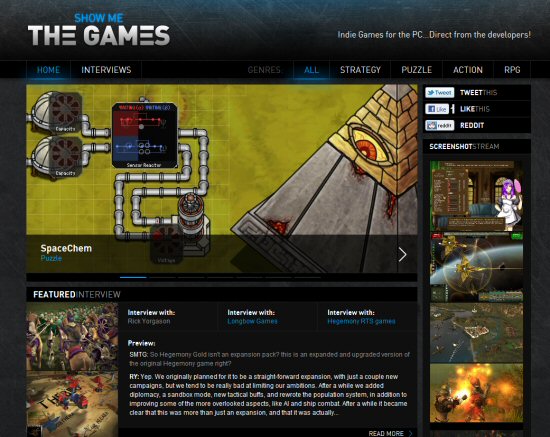
After a long period existing as a rather ugly thrown together mess, my little side project indie games database / promotion website ‘Show Me The Games’ has got a decent revamp:

http://www.showmethegames.com

I think it looks way better:

What do you think?


15 thoughts on Show Me The Redesign!

  1. It’s good! but I’d change the main “single product focus” bit at the top.

    I think the image itself should work as a giant link, not just the description overlay part.

    Secondly the product nav is a bit unusual (i.e. not like Steam or Impulse) – I thought the ‘>’ was going to take me to the next game, the actual nav pips are incredibly short and hard to see / click. I realise the click area is bigger than the pip itself but the rollover doesn’t light-up (and mouse pointer doesn’t change to a hand) unless you’re right on it.

    Oh and the screenshot stream is nice, but captions telling you what game they were from as you rollover would be helpful.

  2. Clicking “Read More” on the interview from the Home page takes me to http://www.showmethegames.com/#, but doesn’t expand the interview. Clicking the same link from the Interviews page takes me to the full interview. I’m using Chrome on Windows XP.

  3. Overall looks awesome! The repeated texture bellow the main background image looks pretty bad though.

  4. Looks good. I’ve found some minor issues (Firefox 3.6.15, Win Vista):

    I expected the screenshot stream to stream automatically.

    White text sometimes is a link, sometimes not. Blue text is eye-catching but not clickable. A consistent scheme would be nice, e.g. blue = link.

    The INTERVIEWS button in the top left corner is not highlighted when I’m on the interviews site.

    Game descriptions have a rather small font.

    It would be nice if the genre type in the top right corner of the game boxes would link to the according genre site.

    I don’t understand what the > symbol means on the BUY buttons. Has this button a special function? Is it for graphical consistency?

    All in all it’s cool, well structured and intuitive. Good work!

  5. Looks great! I second(third? fourth?) David’s comments above. Oh, and the game in the Screenshot, Spacechem? That game is a steaming heaping pile of complete awesomeness. (You thought I was going to say its bad, didn’t you?) =D Just bought it a day ago and it is GREAT. Definitely a good choice to include it on your site.

  6. Looks good. Make the background image fixed. Instead of having the background image only at the top have it stay in the same place as the rest of the page scrolls.

  7. Yay! Looks way better. I always hated attempting to navigate the old page. Now its pretty intuitive. Still feels a little cluttered, but I love minimalism. ;)

    In all seriousness though it looks great.

  8. Yep, looks better, but still cluttered. Also, I’d like if you’d put OS requirements for each game.

Comments are currently closed.