Game Design, Programming and running a one-man games business…

Redesigning my website

Let’s be honest, the positech website is not an example of fantastically awesome web design is it? The design is by me, the humble owner/ coder/ designer/ dogsbody, so I guess I shouldn’t feel bad when comparing it against multimillion dollar company sites, but I do, and I’m trying to make it look less amateurish. here is my first attempt.

Before:

http://www.positech.co.uk/index.html
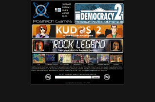
After:

http://www.positech.co.uk/newsite_index.html
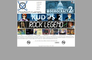
Am I getting better? any suggestions or tips on how to improve it? I know it doesn’t look awesome, but I think I’m getting better at it. All feedback mega-welcome


6 thoughts on Redesigning my website

  1. welcome home cliff !

    to be honest, your new “design” just looks like its had a new coat of paint on it!
    what you really need to do is sit down and work out what you really want from your web site – if you really want it to look like a multi million dollar site ( i think its fine as it is) then you have 2 options : you either hire some professionals = lots of money or you spend lots of your precious time going on web design courses and working on your site design through trial and error.

    My own web site looks like it was made 5 years ago : but its all mine : i started it from scratch with an empty page, no blog tempkates … its taken me a long time to get to where i am and i still have a long way to go.. but its cost me nothing and i am learning everyday. My web stats are growing slowly…etc

    So hope that helps? do you really have the time to learn how to design your site professionally? On the other hand do you have enough money to pay all those experts if you decide to get help?

  2. I’ve always kinda liked the black website. It’s easy to navigate and doesn’t have dozens of useless links. Most websites are way too bright and strain the eyes to the point of a headache.

  3. Don’t know how hard it would be to implement but perhaps having a link to a shop where you can see all the games that are available and their prices at a glance would be pretty nice IMHO. The only option at the moment is to click on each of the game links and then clicking on “Buy Game” to see how much the games cost.

    Also what would be cool (IMHO) is if someone made some video ads of your games and you could post them on the front page? Considering we are living in the “Age of YouTube” and quick streaming videos perhaps a professionally done ad (or one that is close as possible to one) would do the trick. Some people are too lazy nowadays to even bother trying demos without a quick 3 minutes synopsis on what the game is about (even if the demo file size is small :)) – however you could argue that the target demographic for the games aren’t the sort with short attention spans :P.

  4. I also like the black one better. Easier on the eyes. :) It’s not the design that need work, it’s the structure (every game has it’s identical homepage).

Comments are currently closed.