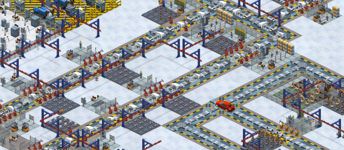
Game Design, Programming and running a one-man games business…

The unintuitive GUI

There are a lot of games on steam.  Those games are also cheap, PLUS steam has a refund policy. As a result, gamers don’t have to be patient. To be blunt…if gamers get confused or frustrated playing my game(s), they can refund them, or forget about them, and play something else. This is so different from when I was a kid, games were EXPENSIVE, there were far fewer of them, and you had to sit there and try things until stuff made sense. If you were really lucky, there might be a manual. These days, even if there is a series of explanatory videos, an illustrated manual, pop-up tooltips and an in-game tutorial, most players will ignore ALL of that, and just try to wing it. If things don’t make sense… your game is toast, your review score drops, your refund rate goes up, your sales go down, and you find yourself practising ‘do you want fries with that’ in the mirror ready for your next career move.

Obviously this is suboptimal.

I make innovative and fun games that have historically been a bit confusing to play and a bit buggy. This is the year where I try to address my game production shortcomings. Early Access is a godsend to me, as is collecting metrics on gameplay usage (anonymously). I can tell when people do not use a feature, and collect a lot of opinions from people on what sucks, and what needs work. I’ve made real progress in the last few weeks on reducing the bug count in Production Line, and I know I have a fair bit of work to do when it comes to the GUI and the ease with which players understand the game mechanics. In short, I need to give some more thought to a lot of my first-pass GUI choices.

A few screenshots illustrate a ton of minor things I need to give some thought to. Take this example:

Theoretically thats a fairly obvious and simple piece of UI that shows you information on the imports to a production slot in the game. The player uses this tab to adjust where those imports come from, presuming they have researched the tech that allows such configuration to be made. Each line shows a different resource item that comes in, the percentage of the last 100 items to be used that were locally produced (within this factory) and 3 mutually exclusive buttons to set the import mode for that resource.

There are potentially loads of issues here. The game tracks the last 100 items used by this slot, but if 90 of them (in this case) were Door Panels and only 10 were Chips, then the sample size for chips is way lower, and the ‘local’ percentage is not as accurate or granular. Does this matter? Does the player know what ‘local’ means? should there be a tooltip for that part of the GUI (there is for the buttons, but the player may not hover-over those). This entire tab is also hidden (grayed out at the tab button level) if the player has not researched the tech. Should they still be able to see the local percentage in this case? or are we fine hiding that from the player until then?

Then we have those selectable buttons. Firstly, do they look like they are clickable? They change the cursor and highlight on mouse over, is that enough? And is it obvious they are exclusive to each other? they don’t ‘look’ like conventional radio buttons used in multiple-selection. Should I change the UI? Finally, whats with the text? it explains things but isn’t it a bit clunky? Should I have column headers with text and then just radio buttons with green check buttons to illustrate selection on each line? would that make more sense? Does all this text even fit in German?

Lets take another look at the same bit of UI in a different circumstance:

In this case, the entire efficiency tab, which normally contains a pie chart, is completely blank. Why? because nothing has actually happened in the last X seconds of game time, meaning that there is no data to display here. However, this is surely a GUI bug, we should be drawing a pie chart anyway and showing the last state the slot was in surely? Thats easily fixed… Meanwhile the entire slot is effectively paused, because the stockpile is FULL, and there is no room to export more product. Effectively, we are on hold due to a lack of component usage or storage elsewhere in the factory. The ONLY clue to this is the ‘Status: No export room’ text. This is woeful. The immediate state of the slot is not even that obvious to ME.

Possibly I should highlight that status in red, or have it flashing, or maybe both. Perhaps the grey progress bars should be red, or flashing?

While I’m at it, on the stockpile strip, those numbers show the currently in stock value PLUS the number of requested items currently en-route in brackets. Nowhere is this explained. Can I explain it easily in the space provided? I shouldn’t make those icons any smaller, but maybe instead of numbers I should just have 16 slots for icons and a different color or shape to show which ones are en-route? Would that make more sense? would it be visually cluttered?

There are no trivial answers to any of these questions, they all need some careful thought and experimentation. I may end up changing all of this, or none of it. Maybe some of my ideas would make things worse…its hard to tell without trying. the really painful thing is that the end user who buys the final game post-release wont see any of this. They will see a GUI layout of a window with some text and icons and think that it all sprang into existence fully formed. It really isn’t like that. To get the level of UI polish I want (and need) I’m going to have to iterate on this stuff a lot. This is tricky when you are the only programmer, and only designer. There is much to do…


Designing the QA system in Production Line

This is a big feature in my car factory game Production Line that I have been putting off until I could really set aside some time to think about the design seriously. I think I’ve finally reached that point in Early Access where I need to flesh out the design for this part of the game, and also importantly, to listen to feedback from current PL players about how they think this should work.

The current system is pretty simple. cars have work done to them on the production line, and then at the very end of the line, just before export, they go through a pre-export QA process that is broken down into emissions test, visual inspection and performance tests. All cars are assumed to be thoroughly free of defects, and are sold on the basis of their features and their price relative to the perceived value of those features.

Obviously in the real world, defects and car quality is a thing. You wouldn’t expect any defects on a $150,000 car, you would expect very few on a $70,000 car (unless its panel gaps on a tesla…dig dig…), and probably be more tolerant of minor things on a cheaper car. High end car companies (Rolls Royce etc) probably go overboard on quality assurance to ensure a reputation for zero problems (Lexus are also good at this), whereas at the lower end, its probably less of a concern. How to best represent this in the game in a way that both feels reasonable, and makes intuitive sense, and also works within the existing game design, and above all feels interesting and fun?

For a while, I have wanted to combine the idea of defects with the introduction of an area-of effect mechanic. One of the most interesting aspects of the game is the designing the layout of your factory, and at the moment, apart from making sure importers and exporters are in the right place, and ensuring that you only place office slots (like research) in office zones, there is not that much *positional* decision making involved in the game. I thought I could introduce this with the advent of new QA slots, that had a radius effect.

The system would work by generating defects at every point along the line. there would be a base level of defects that would be generated each time a task was carried out on a vehicle, including tasks generated through upgraded slots. For example, adding the rear axle = 1% chance of a defect. Adding a tire pressure sensor… 1% chance of a defect… and so on. Some cars would go through the line entirely free of defects, but many would not. Eventually, if ‘untreated’, those defects would make their way into the final cars which would be sold.

For every car sold with defects (depending how many), there would be a negative impact on the reputation of your brand, a new, lagging indicator which would affect the purchase enthusiasm of your customers. Obviously this would be something you would want to keep an eye on, so as to ensure customers were not turned away, so how do you prevent defects? and how do you treat them?

To prevent defects, you can place down QA stations, which would be area-of-effect based, and would essentially reduce the percentage chance of a defect occurring at any specific point on the line. Covering the entire production line with regular QA slots would be a way to keep production quality high and defects low, but obviously would have a cost in terms of employee pay and the floor-space required to add those QA stations. This would be a ‘prevent defects from ever happening’ approach to QA. The second approach would be to introduce a new ‘re-work’ slot right at the very end of the line (maybe just before the current QA section) which would examine each car, and take whatever time is needed (maybe 2 minutes per defect?) to fix the problem and allow a perfect car to travel beyond that point. Clever players would eventually use smart junctions (which would need defect-based rules added to them) to ensure that cars that randomly seemed to be defect-heavy did not cause a major slowdown. As I understand it, in real factories, cars that need re-work are immediately taken off the line and dealt with separately so as not to cause any real bottleneck.

This is my first attempt at designing a QA/Quality system for the game. I’m very interested to know what existing (or potential) players of the game think. Essentially it boils down to this:

  • Defects are randomly generated on cars as they are constructed
  • Area-of-effect QA stations reduce the likelihood of those defects when placed on the line
  • A re-work area can optionally be placed to fix defects at the end of the line
  • Defects will affect the brand image of the company, and thus customer eagerness to buy.

Thoughts?


Improving the marketing design for Production Line

If you aren’t already a player of Production Line, you probably dont realize that there is a part of the game where you can place down marketing facilities (once researched). These allow you to generate a flow of ‘ideas’ which are basically marketing points. Those points get spent on new marketing campaigns, in TV, Print or Movie form. Right now the only target for these campaigns is ‘brand awareness’ which essentially means more people will come into your car showroom and consider buying your cars. So far so good… This system has been in the game for a while, it works, there are no bugs, everything is kind of working as intended.

But yet it isn’t really, because it turns out that generally speaking people just don’t use the marketing features at all. They get excited when they research them, throw them down, and then run some campaigns (which cost a lot, but due to balance issues, some players at this relatively late stage of the game have LOADS of money, so its not an issue), and just kind of assume they worked, without really bothering with them any more. The major problem was the lack of feedback to the player on the progress of the marketing campaign, and its effects, PLUS there were balance issues meaning they may have been relatively pointless anyway.

Dealing with the GUI stuff first, I have replaced the event pop-up in the bottom right of the screen (easy to ignore) with a central modal dialog for whenever a marketing campaign ends which prompts you to run another campaign, and also for the first time it now gives you a breakdown of the extra customers the campaign bought in, how many cars they bought, and the revenue that this generated:

I also changed the GUI for the market screen which shows the current number of visitors to your showroom, so that it has a tooltip which breaks it down into the ‘base’ number plus those who are bought in by your marketing efforts:

And finally I’ve changed the GUI for the marketing screen itself, so that for campaigns which are currently being run, you can keep an eye on those customer, sales and revenue numbers as the campaign is running:

So with luck, that has a major impact on encouraging people to use the marketing feature in the game. They should no longer be oblivious to the effects of the campaign (which is probably the biggest factor), plus they can no longer be unaware that a campaign has ended. Obviously a campaign ending does not automatically mean you have enough marketing ideas to launch another, and maybe I need more hints and pop-ups/GUI indicators to point out to the player that they now have sufficient ideas for a new campaign, or to prompt them to maybe invest in some more marketing facilities.

So anyway… thats just half the problem, which was UI/UX related. The other problem was balance/Sim related, and that also needed some tweaking. Like everything related to balance in a game this complex, it will probably require a number of iterations to get the numbers just right, as designing a game with so many inter-connected parts really is a massive number-tweaking problem. The problem here was that the player was essentially never reaching a point where the number of customers in the showroom was a limit, so they never saw any pressing need to spend on marketing to get more customers through the doors.

Obviously the player can always sell to every single customer that walks through the door, IF their prices are low enough, but this may entail selling cars at a loss. What I need is to ensure that the player sees that by enlarging the number of potential customers, the number of actual buyers is going to go up, WITHOUT reducing prices. This may be intuitively obvious to some, but maybe not others. If you have 80 showroom visitors per hour, and produce 20 cars per hour, would you automatically think you need more visitors? This is hard to convey.

Regardless of communicating this, it did seem like the number of customers was basically not enough of a constraint, so I have adjusted the numbers so that fewer customers show up, but they are more flexible on price. That *should* mean that balance is not vastly affected, whilst keeping customer numbers low enough now that the player sees an incentive to boost them with marketing. I suspect it wont be enough, and I’ll need to communicate this in other ways, maybe by showing the total potential pool of customers, and what percentage of them actually check out your cars? I have a stat already for market share, but thats sales, not views…

Anyway…. I think its all progress on the playability and balance of the game. Bit by bit, the game is getting better every day :D

Game pace vs content cost

A friend of mine is making a game that looks absolutely stunning. its a 3d action game, and its got a wonderful art style. The art ‘design’ is fantastic and the level of detail is really high. There are lots of tiny little interesting objects all around the world that have been lovingly modelled and textured and animated and had sound effects attached to them. It makes for a lovely world. The game is a sort of survival/action thing with some sneaking, but a lot of running, and as a result, you get through areas of the game relatively quickly.

Here is an icon from Production Line (my car factory sim).

If you play Production Line, you’ve seen that graphic a lot. Its in every game, all over the place. You see it maybe 10,000 times in the course of a decent play-through, and it may be on the screen 70% of the time you are playing, because its a key resource in the game. You can guess that, lovely though it is, it didn’t take days of artist time to make this icon. In other words, getting that piece of ‘content’ produced was pretty cheap.

Content is cheap, but at a certain level of output, the cheapness starts to multiply and become not so cheap…then expensive, then ruinous. This is why the realistic FPS scene is dominated by a small number of big players. You simply cannot make a photorealistic style FPS that is only going to sell 500,000 copies, even if they are all at $59.99, because you will go bankrupt immediately. Take a look at this:

Its awesome right? Its amazing that video games look this good these days. But textures that high-def take a LOT of time to make, vs the 128×128 pngs in Production Line. And worse still, MUCH WORSE, is that you are running around those worlds at a high pace, zapping, shooting, dodging, jumping. You are not sightseeing, you are running like crazy.

In a multiplayer FPS, things are not so bad. You can limit the fighting area, and get a lot of mileage out of a relatively small area. In a single player action game, you are going to whizz through that content at high speed. This means you need a LOT of content, especially when gamers are constantly complaining that a game that cost them $59.99 is *only* 40 hours long. (A pretty good cost/entertainment ratio in any media frankly). The situation is so bad, that even the huge budget publishers make sure that game stories include some reason why you have to backtrack, and ‘revisit’ older areas of the game for some nebulous story reason. This is not lazy writing, its producers and accountants telling you that you need 40 hours but only have the budget for 10 hours of content experienced at the expected pace.

Few indies are crazy enough to make an FPS, but plenty make ‘fast paced’ games. Be aware that you need to take the content-consumption rate into account when designing your game. It is, of course a balancing act. On the one hand, you want the player to constantly be exposed to novelty, to ‘keep the game interesting’ but on the other hand, you simply cannot afford to do this at high speed. You need to design your game according to your budget, or you risk making a heavily compromised game, or running out of money. Do not fall into the trap of thinking games need a ton of varied content to be good. Chess has few pieces and a tiny game area, yet has entertained people for an amazing amount of times. Some of the best, most classic TV episodes are those written with only a single set and 3 or 4 characters, for purely budget reasons.

If making the player move 10% faster adds 10% to the required content and dev time/budget, is it still a good idea?

I have many leather-bound books and my car smells of rich mahogany

Thats paraphrasing the great Ron Burgundy, in case its not clear… Anyway…

One of the main areas of game that is ‘missing’ from the current alpha build of my car-factory sim game ‘Production Line‘, is all of the high-end stuff that goes into real luxury cars. (By luxury I am meaning $100,000+) Right now it is very hard to actually make a car that you can sell for $100k without a huge markup, and although it can be argued that cars at that price range *do* have a huge markup, its not quite *that* crazy. Some of the things that spring to mind are probably high-performance engines (turbo etc, lots of cylinders, or multiple motors for electric cars), fancy bodywork such as gull-wing or falcon wing doors, and plush interiors. I’m currently thinking about the design of the ‘plush interiors’ stuff.

Although its probably declining in fashion, there is definitely a market in luxury cars for real-wood in the dashboard and other internal parts of the car, such as the area around the gear-stick (thats stick-shift for you Americans?). I am guessing that the price differential between a simple plastic dashboard like you find in most cars to a smooth polished and multi-layered varnished wooden dashboard is probably pretty massive. FWIW I used to varnish mahogany for a living. its harder than it looks, especially if you want that smooth-as-glass finish without a single blemish. Its all about removing all the dust. I digress…

A quick glance at the BMW configurator (UK) for the 740e saloon (about the right price range) shows me such options as ‘fineline wood high gloss’ for ‘included in price’ to ‘Eucalyptus smoke brown’ for an extra £995 ($1,373). Thats a nice handy nudge towards luxury pricing in my game! Wooden dashboards here we come.

Dashboards are just one thing, what about all that shiny chrome stuff you get in cars, surely that costs a bit too? Indeed it can. A pair of chrome wing-mirror covers for the Jaguar XJR (A stupidly slow and overpriced low-tech car for the money…but again…I am getting distracted) will cost you… £198 ($273). Even Aluminium gearshift paddles cost £389. its hilarious how peoples sense of perspective implodes the minute they buy a luxury car. Anyway, its amazing how many bits of a car you can cover in chrome, if you want to give it a ‘luxury’ feel, and I certainly don’t want to bore the player (and complicate the GUI) with a bazillion options, so I was thinking of just including a single ‘chrome fixtures’ upgrade for luxury cars in the game. I’m guessing $1,000 should cover it? I’m amused to discover both that Aston martin calls this stuff  ‘jewellery pack’ and that it doesn’t price it separately! haha. Its configurator is hilariously gratuitous.

The third option that I plan to add soon is that of interior lighting. The Ford ‘edge’ talks about ‘enhanced ambient lighting’. This is the stuff you dont notice until its gone, but it includes subtle lights in the foot-well by the pedals, the lights by the door handles on the inside, and those cool lights that gently fade in and out when activated rather than snapping on. Looking at the difference between models, I think some companies are charging up to $700 for a ‘premium ambient lighting package’.

So that gives us an extra $3,000 of new features to push up the price of our car. To summarize:

  • Premium ambient lighting package
  • Wooden Dashboard
  • Chrome fixtures

Thats the easy bit, where do we add these in the production line? Right now we have ‘fit dashboard’ which is part of the larger ‘fit accessories’ task. At the moment it takes 2.0 seconds of player time, but it has a number of additional options, such as ‘driver and passenger airbags, a heater, and touchscreen. This already can cause a bit of a bottleneck, so how about this as a solution:

  • Split the existing ‘fit dashboard into two tasks: ‘fit controls’ and ‘fit cabin options’. I can rename the original ‘fit dashboard to ‘fit interior’.
  • Set the wooden dashboard, chrome fixtures and premium lighting to be options under ‘fit cabin options’
  • Set the airbags, heater and touchscreen to be options under ‘fit controls’

The only problem with this would be that if I have the fit interior needing research to be split into two, that means you need to do this research AND expand the line slightly before fit heater & airbags and touchscreen become an option. What I *could* do here is to allow them to also be options under the parent, which should work AFAIK, but is something I have not done before. Would that be confusing? Hmmm.

So question one is does this work for everyone as a system to incorporate these new features in the production line. Wooden dashboard would require the new wood resource, chrome requires chrome, and ambient lighting would need sensors and light bulbs (also a new resource).

My second question on this is where these items should be researched. Wooden dashboards isn’t really a ‘technology’ so might it be something we can add to the design studio instead? That facility does become redundant once all the current body types are done. Or… is that going to lead to confusion? Also surely getting the right production processes to build a wooden dashboard surely *is* a sort of technology? Hmmm.

As always, thoughts and opinions are very welcome.