Game Design, Programming and running a one-man games business…

Advertising (and a bad back)

I hurt my back chopping wood, how tragic. This means I am a) in agony and b) not able to talk about gamecamp in London, because I couldn’t go :(

Instead, I shall waffle on about advertising!

I’m one of the few indie devs that actually believes in advertising. Everyone else seems to think it does not work on a small scale, as in <$500,000. It does. Even spending $1 on ads will make a difference, the problem is, that it’s a difference too tiny to measure. Measuring ad results is a minefield I’ve blogged about a lot in the past.

One thing I like about ads is that it’s truly remote and spontaneous spreading of news about your game. Most indies don’t get spontaneous website coverage unless they actively find a reviewer, send him a copy and pester him/her for a review. By definition, that narrows the circle of publicity about your game. Who knows how many Ukrainian gaming blogs have readers who are oblivious to Gratuitous Tank Battles, because I don’t know those blogs exist?

I rely heavily on hard evidence and stats to pick the best advert designs, but here are some GTB ads. Let me know what is good / bad about them, or if you have any cool ideas for them. I tend to use static, not animated ads, as I find animated ones have little real difference to CTR, and frankly, I don’t like being associated with cheesy flashing things.


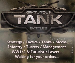

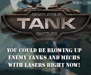

I’m planning on using these on google adwords, but maybe project wonderful and game-advertising online. I like the way google lets me target certain countries and restrict it to PC’s rather than macs/phones, but I hate the complexity and approval delays for their campaigns. I wish many more gaming sites would investigate using project wonderful instead. They are really good.


14 thoughts on Advertising (and a bad back)

  1. On the opposite side of the spectrum, ads just don’t seem worthwhile on my site.

    A lot of my traffic is repeat visitors and I hate the thought of showing them stuff I cannot really control. The return is just not enough to justify it.

    If I could guarantee quality ads it might be, but that is not google.

  2. project wonderful lets you set things so you as the website owner have to approve an ad before it appears, which may suit you. They notify you that ad X wants to run on your site.

  3. Of the square ads, I definitely prefer the last one. Its message is clear and simple. The other two feel like you’re trying to squeeze in too many bullet points in one sentence.

  4. As cool as those big tanks are, I like the contrast in the first wide rectangle (and also the last wide rectangle, although slightly less so there) the most. Two things that would be interesting to experiment with in the top add: making the first soldier smaller so there is more of a progression from left to right, and adding some chaotic background fire fight (but keeping it dark and relatively low contrast).

  5. Of those nine, the only ones I really like are the third (browntanks.jpg) and the eighth (rect3.jpg).

    IMHO, the first one (3units.jpg) might have some potential, but needs some work: The white is too stark a contrast, a shade of grey or a metallic texture or not filled-out night-vision green outlines might be better. The infantryman should face the same way as the tank and the mech; it should at least be flipped horizontally or preferably be replaced with a view that’s less straight on and also has a gun that isn’t pointing right at us but rather in roughly the same direction as the other two’s. The tank also needs to be cleaned up; isn’t completely filled with white yet, there’s still some pixel noise left. The font for the mathematical symbols should also be smaller; their “bars” shouldn’t be wider than those of the letters in the word “TANK”. Maybe the plusses (“+”) could also be replaced with small versusses (“vs.”). As a picture is worth a thousand words, here’s a quick mock-up to illustrate: http://i.imgur.com/3uuth.jpg

    For the second (blacktanks.jpg) and fifth (gtb_tanks.jpg), I also find the flat colour background both too much of a contrast and too boring. Some texture (grey metal, red-brown sand) might be better, like the third one (browntanks.jpg), which I like, or maybe even scenes from the game like in the fourth (gtb_lb1.jpg). That one is OK, on its own, but I think it might be improved by the addition of one or two tanks to the sides of the logo as in the the other banners. Maybe sized down a bit so as not to obscure the entire scene.

    The sixth (rect1.jpg) and seventh (rect2.jpg) both have too much text in an uninteresting font and overuse slashes (“/”). If you really want a list of stuff, I’d suggest using commas, bullets (“•”) or five-pointed stars to separate them and to use less of them, maybe something more along the lines of:
    _____GRATUITOUS
    ________TANK
    ______BATTLES
    Tanks • Mechs • Infantry
    Attack • Defend • Prevail

    But really, a simple slogan like in number eight (rect3.jpg), or maybe just “Your country needs you!” in the seventh would probably be best.

    Finally, in the ninth (skyscraper.jpg) I think the logo gets too small and “gratuitous” and “battles” become too hard to read, I’d suggest a modification in which those words are as wide as the word “TANK”. Similarly, the screenshots are also too small to make out much. Maybe a big slice from a single screenshot would be better, quick mock-up: http://i.imgur.com/Dzylg.jpg

    Oh, and get well soon!

  6. I’ll tell you what would make me interested: I find tanks fairly boring, but mechs and lasers are awesome, especially when combined (and contrasted) with tanks. So to me the 1st ad and the one with “YOU COULD BE…” are the most appealing.

  7. Argh, back pain sucks :/ Careful with that axe, Eugene :)

    I would be most likely to click on the ones with screenshots, (gtb_lb1.jpg and skyscraper1.jpg) since they give me an immediate idea of the style of game (and if I could tell that it was not a style I liked, I wouldn’t click and wouldn’t be bleeding your ad budget with a poor conversion rate). Since the screenshots aren’t high enough resolution to get a good look, I’d also be inclined to click through to see more detail.

    rect1.jpg and maybe rect2.jpg are in a similar vein – they are descriptive so I feel like there are probably more likely to generate ‘good’ traffic with a higher conversion rate. These two don’t have that same ‘professional’ feel about then though – not sure if that’s likely to be good or bad for the conversion rate in the case of an indie game. The others, where you can’t really tell the genre/core mechanics of the game before clicking through would seem less likely to be effective.

    Have you considered adding a little Positech logo on there ? You have been building a (respected) brand for many years now – if I saw “Positech” but hadn’t been keeping up with your latest releases I may be inclined to click through purely based on the brand (in fact if I cast my mind back, I believe the name “Positech” and my gut feeling about it’s meaning was one of the factors that intrigued me enough to follow a link to your site a number of years back).

  8. >I like the way google lets me target certain countries and restrict it to PC’s rather than macs/phones

    Google Adwords allows you to target desktop computers or tablets or phones via the campaign settings. And you can target different countries. However it doesn’t allow you to discriminate between Windows and Mac OS X (unfortunately). Perhaps it will one day. Or did I misunderstand?

  9. Yes thats a good point, it doesn’t filter by O/S, but there is surely no reason why not, given that the code can tell you the browser version etc of all visitors somehow (not sure how that works tbh :D).

  10. Google could easily filter by OS if they wanted to. I think it would be in everyone’s interest. Currently it is rarely (if ever) worth Mac developers using Adwords.

  11. I could be wrong but I /think/ they don’t bother filtering by o/s because browser strings are notoriously iffy while country can be determined by ip address and they can fall back on your google location settings if need be.

    Back to the ads, it’ll be interesting to see the results of your split tests as to which is better. Hope you post the results.

    Hope your back gets better too mate!

    Iain

  12. oops, I’m a bit late, but for me these are the most appealing:
    3units1 (perhaps with actual 3d models on the left?) and rect3 (I like the simple tempting message!).

Comments are currently closed.