Game Design, Programming and running a one-man games business…

Website experiment #1

I thought I’d blog these in future. I’ve been trying out this page:

http://www.positech.co.uk/gratuitousspacebattles/index.html

Vs this page:

http://www.positech.co.uk/gratuitousspacebattles/index_var1.html

To compare what percentage of people click the demo button. The second one has some missing content, and I theorised that fi there were less distractions and fluff on that page, it might push more people to hit the demo button. In fact, I was wrong:

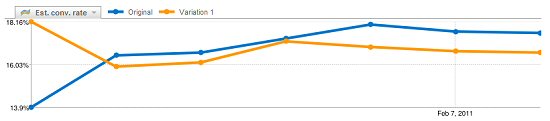
Still, it was worth a try :D


10 thoughts on Website experiment #1

  1. Nice theory, I would have assumed the variant would be better too.
    Have you tried anything with placement of the demo button? it seems unusual that I would have to scroll down to see it, was that the result of previous testing?

  2. You know, the y-axis scale scale suggests that the numbers might simply not be statistically significant.

    I understand that you like numbers — I mean, just look at your ten past posts — and if you are serious about this, you should look past which line goes above which. The line is just one instance of what could have happened; the whole range of possibilities is described by some law of probabilities. This means that, to really apprehend the situation, you should make this line a bit fuzzy and imagine instead a cloud, in which yhour line would lie; the middle of the cloud is the data mean and its width would be proportional to the variance of the experiment, if we could repeat it. The cloud encompasses a certain proportion of all possible experiment outcomes, let’s say 90% to make it not grow too wide (in our heads, this is still a thought experiment, you don’t have the data yet to make it real).

    In this framework, comparing two variants of your front page would entail the comparison of the clouds. If the clouds overlap, *you just can’t infer anything* from your data. They are not significantly different. To infer a significant difference, one worth deciding upon, the clouds compared must not overlap. Seeing how your two lines are very close to one another, with the widest difference between the two close to 4%, I think that the sanest conclusion to draw from your curves is that your front page variation did not affect your demo conversion rate. It was not detrimental nor better; the data just doesn’t expose any statistically significant data (again, this is a nose guess, a priori to proper data acquisition and crunching).

    Keep up the good work, Cliff!

  3. The various tests you continue to perform show how much work an indie has to do to make a success of their venture, and I think that you help to inspire other indie developers to put the extra effort in to make their games more successful. Keep up the great work and excellent blog.

  4. That’s a huge difference – almost a 5% increase (say 16.5 -> 17.2, it’s difficult to tell from the graph) from Variation 1 to Original …

  5. I don’t find this graph too reliable since when I first loaded the page I didn’t saw any difference until I scrolled down.
    Maybe you could consider putting the Download Demo a bit higher on the page so people with vertical resolution <900 can see it without having to look for it below the main part of the page as opposed to above (which is where I'd wager most people look for a demo download button)

  6. I would say that var1 lacks the perceived ‘depth’ the other page does.
    The making of bit and the model at the bottom indicate that this is a much bigger game than just having the usual screenshots and video. It adds a certain uniquness to the content of the page.

    The other thing, I think, that could be affecting it is the position of the demo button in relation to other elements on the page. In the normal page it seems to be somewhere in the middle of the page (two thirds down, I know) but on the other page to me it looks almost as if it was stuck on the end as an afterthought instead of being an integral part of the page.

    I’m no expert on web design, but I hope my comments may be useful.

  7. I think it might be because in (var1) the demo button starts to feel like the “bottom of page” garbadge. I wonder if users scroll to the bottom, and then bounce their view up a little bit. A guess!

Comments are currently closed.