Game Design, Programming and running a one-man games business…

Much better deployment UI done

I’ve made good progress today and yesterday, despite distractions by Anno 1404, and being a bit ill. Here is a screen showing the new deployment layout. The UI needs polish, but this is how it looks.

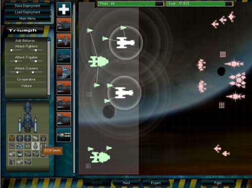
I’ve got proper selection and multiple ship AI-editing working now. This means you can drag select, or double click select (no shift-add select yet) a group of ships, and then add a new behaviour to them all (if the behavior exist, it doesn’t matter) remove a behaviour, or edit the parameters of existing ones. This means that rubbish copy+paste stuff is gone, and you can edit groups of ships as you would expect to, including selecting a whole bunch and moving them as a group. The icon with a + on it creates a new ship design in the editor. I’m aware that it looks like a health icon, and I intend to redo it… I’ll also move the ‘main menu’ button to bottom left where it clearly belongs.

Also, I’m reliably told that AI ‘behaviours’ sounds weird, and programmy. Does ‘Orders’ sound better? I suspect it does. It’s only a GUI change.


14 thoughts on Much better deployment UI done

  1. Anno 1404 is an insane time-sink, it’s not your fault for being distracted.

    I personally like ‘behaviors’ better, it sounds a bit less like we’re trying to dumb it down.

    Also, do those ship icons have any rollover text?

  2. I would switch the term AI for ‘Opponent’ or something as well – some players may well not be familiar with ‘AI’, as a lot of games do not explicitly call it that (They normally say “Computer player” etc.)

  3. Oh wait… AI is presumably referring to the player’s ships. In either case though, avoid ‘AI’. It could very well be alien to some players

  4. i keep getting confused by the difference between the sillohettes on the field, and the fully textured ships in the picker. i think i’d make the picker have the same as on the field – and do the full texturing for the details windows on the left. (well, just a comment anyway :)

    replace the health-button with a blue-printy type affair?

    what’s the meaning to the backgrounds of the picker ship buttons? (blue/red)

  5. I like “Orders.” It’s simple and clear. You give your minions orders. “Rules of Engagement” and “Battle Plans” seem needlessly complex. And “Behavior” is definitely too AI-speak.

  6. Blue means that ship can be added to the fleet given the current budget and pilot limit. Red means you can’t afford it. I’ll give the same shading/color thing a try and see how it looks.
    I had originally tried a blueprint look, but it wasn’t very good, as it didn’t scale down well, but I will retry that.

  7. Anno 1404 looks cool to me, but I just can’t get past the insane DRM restrictions they have on the game.

    You can get it from Steam, but even there they left in the crazy install limits and root kit from the retail version.

    Sigh.

  8. Orders

    One hour on Anno 1404 seems to be about 5 minutes! Mind bogglingly complex in the late game but a very nice time waster all the same. :)

Comments are currently closed.