Game Design, Programming and running a one-man games business…

Start of UI re-design for Gratuitous Space Battles

Here is a small screen of the new Deployment stuff for gratuitous space battles so people can tell me how I’m doing it all wrong :D

The fleet design screen and pre-deployment configuration screen are all gone. Now there is basically just this. The player chooses a battle to fight, and that brings them here. The difficulty setting selector will sit at the bottom once added. The strips at the top show the current fleet cost and pilot count as a fraction of the limit for this battle. A basic fleet is already shown (only for mission #1, other missions will start with an empty fleet). On the right hand side is a picker showing your current ship designs, and eventually some new icons over here will allow you to create totally new designs (launches a separate window).

How do you add new ships to the fleet or remove old ones?

Answer that in your head first, then feel free to tell me what you thought up.

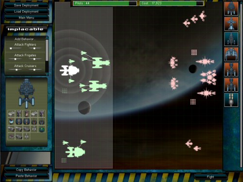
My current solution is that you basically try and drag one of those far-right icons onto the map. It turns immediately into a ship silhouette of that type, and you can place it anywhere in the deployment zone (highlighted). if you drop it anywhere else, it’s deleted. To remove an existing ship, you just drag it out of the zone.

I will also include hotkeys and maybe a right click context menu to edit a design, delete a ship, rename a ship etc. This will all be in the manual, tooltips and tutorial windows, but I hope it will also be intuitive.

Thoughts? Gaps in the UI, font choices etc, are all place-holder and will be finalised later. At the moment, It’s a case of getting the general flow of things right at last. Work-in-progress UI’s rarely look awesome!

My idea is that this represents the ‘design’ of this battle. You can drag ship designs to and from the battle here, launch the ship editor from here, and generally this represents the central hub from which you play with this map.

In total, the game is going to be 4 areas:

  • Main Menu (goes to options screen, online stuff etc)
  • Select Battle screen, with a simple list of missions
  • This deployment screen, and its associated full-screen ship editor
  • The battle screen, where you view the real-time battles.

10 thoughts on Start of UI re-design for Gratuitous Space Battles

  1. I think dragging from the right side of the screen to the left side of the screen to place your ships would get tedious. I think maybe a tabbed container on the left with the current sidebar under one tab, and then the ships under another tab could work, though that doesn’t leave everything out in plain sight. Maybe if the ship list was right above the bottom bar? Or you could swap the bottom bar and the ship list…

  2. my first thought was that dragging the ship on the left into the zone would place it too.
    i don’t think the selection panel should be on the right – you’re deploying from the left.. stuff on the right is enemy. i never even thought to look there :)

  3. yes its true that dragging right to left would be a pain, but i feel the screen may look ‘unbalanced’ if everything is on the left of the map. I might try that, and also try just swapping the ship picker and the column of stuff currently on the left hand side.
    The thing about having two tabs would be the tedium of swapping between those tabs.
    lots to think about :D

  4. It’s looking good! Are you planning on having a different UI ‘skin’ for each of the factions like in Medieval II or just one for all battles?
    I wouldn’t mind dragging from right to left. It’s more comfortable on the wrist than doing it the other way.

  5. 1p worth ships to be deployed or available to deploy should be on the left and I would say should face right as that is the direction they are heading.

    If you want to modify the ship prior to deployment then I think the ship selection should go on the far left, modification then deployment?

    But that depends on the process you want the player to adopt?

  6. I would assume the ships at far right have some kind of rollover info to describe the design a bit? If I create a ship and name it the Viper for example, the rollover text should not only say Viper but preferably the loadout, because weeks after making it I may not remember that the Viper was a missile destroyer or a frontlie tank etc.

  7. What you describe for adding and removing ships is exactly what I expected. A few thoughts:

    – As noted above, since I’m deploying on the left, I would expect my palette of ships to also be on the left. Swapping the two sidebars seems like a good solution. Also also mentioned above, the ship icons on the buttons should probably also face to the right.

    – Since the palette looks like buttons, ideally they should work like buttons as well. To take a similar example, from Yahoo Pipes, clicking on a button could cause a copy of the ship to appear to in my play area, using some crude “Look for space” algorithm. If I do this a few times, perhaps pop up a “Reminder: you can drag and drop ships into the main play area” to ensure that people know there is an arguably faster solution.

    – Similarly, you could add a trash can that appears when I’m dragging a ship. I can actually trash a ship anywhere, but the trash can is so obvious you’ll reduce some confusion. Since dragging a ship onto the “fight” button is meaningless, you might replace it with a trash can when dragging.

    – I’m a fan of right click menus, even (especially?) if they only provide slightly faster access to functionality I have elsewhere.

    – I’m hoping I can rubber-band select groups of ships to move them around, and ideally copy them.

  8. “The difficulty setting selector will sit at the bottom once added”

    wait, that means that the enemy fleet changes as you pick the difficulties one by one?

  9. I agree with the other comments encouraging you to do something about having to drag-drop ships from the right side to the left. Switching the sides of the palettes seems like a reasonable solution.

    I also like Alan’s idea about having a trash can icon (or some other indication like a big red ‘X’) that appears when you are dragging a ship out of the deployment zone (in order to discard it from the fleet).

    Are there going to be situations where a person would want to add a bunch of the same ship? If so, how about allowing the player to click the ship icon from the palette to deploy ships? Each click would deploy one ship of that type, so a player could rapidly deploy a bunch of ship X, then click rapidly on ship Y’s icon to deploy a bunch of ship Y. The player then has to go through the process of putting each ship where he/she wants it to be, but this would shorten the whole dragging/dropping business.

    As for the very basics, the drag-drop interface is what I would expect! Well done!

  10. whats about the bottom ?
    in the most of the RTS games the bottom of the UI is used as a Controlterminal.
    Yes, of cause is gratuitous space battles isn’t a normal RTS, but IF the big games have it ,then it couldn’t harm this one.
    some of you maybe thinks know:the battle screen is way to small with a UI at the bottom.
    Don’t want to force cliffski to make some extra code, but oney solution of the small battlescreen could be Zooming.
    IF something to little, zoom it in ;)

Comments are currently closed.