Game Design, Programming and running a one-man games business…

Mip-Map hell with Production Line

In a recent conversation with fellow indies about how I can make production line look better, someone effectively said ‘why are you not using mip maps’, and at first I laughed because, LOL, I use mip maps, and then I remembered that the geniuses at Microsoft decided that D3DXSaveSurfaceToFile should not generate mipmaps so actually…the game didn’t use them for many of its props (the stuff in texture atlases, basically).

So obviously I immediately thought what a dork, generated mip maps and…

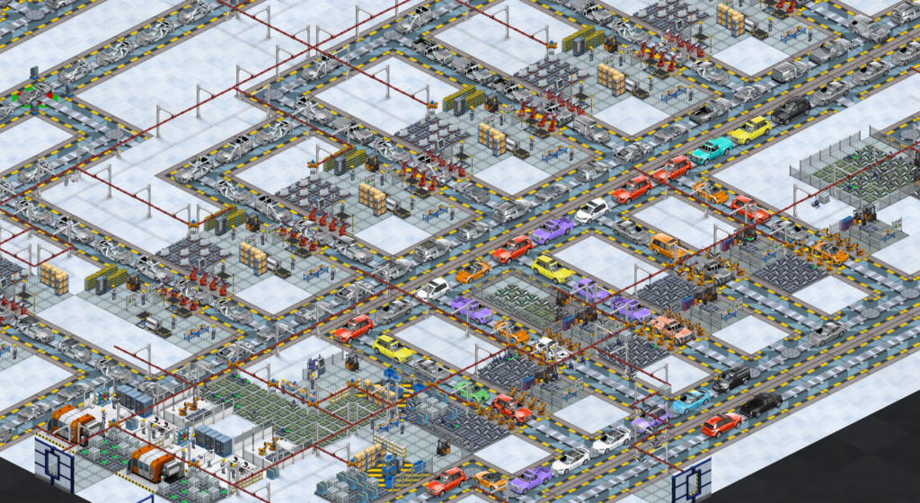
it kinda looked way worse. Or did I? I have stared at the pixels so much now I am starting to see things. Here is the game as it currently looks (mip maps enabled in engine, but most of the car graphics and prop graphics not generated with any). (click to enlarge)

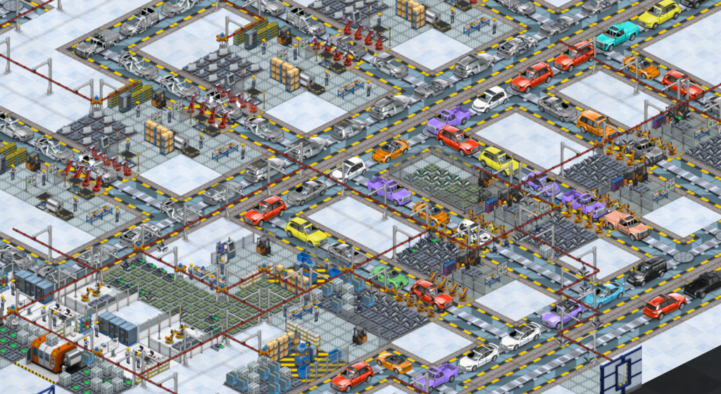
And here is it with mip maps enabled. (click to enlarge)

From a distance does it look any BETTER to you? I’m not sure I can really tell much of a difference until I zoom in. Here is evidence of how blocky the current one looks when zoomed in…

versus the mip-mapped one.

Which obviously looks better, but its not *that* simple, because the mip-mapping also creates some artifacts. here is a montage of the current, and lots of mip-mapped styles, with different settings from mip map creation filters, sharpening and softening etc. I just can get those door lines to vanish…

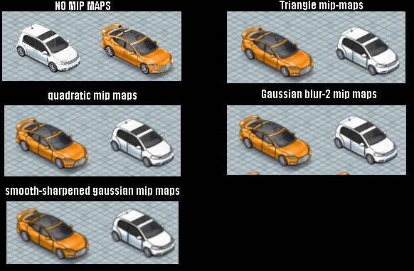
Which possibly means that I need to adjust how those cars are being drawn, or means I have not yet found the perfect set of render options for generating dds mip maps. There is also the possibility that the way I render out my car-component atlases (with a black background) is bleeding onto the mip maps at lower levels, and that this is where the problem is.

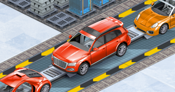
Of course all of this is absolutely *a matter of opinion* and thus really annoying, as I am a data-driven guy and like hard facts,. so stuff like this is where I fall down a bit. I don’t like pixellated graphics ( I despise the look of minecraft) but on the other hand I also REALLY hate over-blurred images, which make me think my eyesight is failing or I need new glasses. Its also very tempting to give in to the mistake of zooming in to a static image and declaring the best one to be the one where a zoomed in screenshot looks best, which is WRONG because obviously when zoomed right in, the mip maps are irrelevant anyway. here is the current (non mip mapped) car zoomed in.

Which leaves me in a bit of a quandary. Is it even worth continuing to fuss over this stuff…does anybody really notice/care? Or should that time be better spent on adding new features to the game?


7 thoughts on Mip-Map hell with Production Line

  1. Hi, with the mip maps it does look slightly better but in my opinion the difference is to small to justify spending a lot of time into implementing it into the game. I think it would be better to work on something more noticable by most players (new features, DLC, etc).

    Best regards,

    Brecht

  2. I noticed :)

    But I only noticed because I was looking closely at screenshots and searching for ways to improve them. I’ve seen screenshots of this game for years and all I thought was “it’s a bit noisy”. This is one of the reasons why.

  3. The mip-mapped one looks better, but too blurry on the factory equipment, and shelves/boxes, etc.

    Is there a mip-map-bias setting in your implementation anywhere? It’s supposed to affect the sampling. In Unity, you can adjust that value into the negatives to do a fake sharpen at runtime.

    1. Also, the black background bleeding in makes perfect sense to me. It shouldn’t be too hard to test that.

    2. Thats not just a unity thing, its in directx too. I could definitely fiddle with the mip-map bias. I think I just need further experimentation with the mip map generation options. I personally like a mixture of the non-mip map and mip-mapped look, but without the hard black borders.

  4. The black halo is a common issue with mip-mapped sprites. It is the colour of pixels with zero alpha bleeding into image by bilinear filtering. It is a bit counterintuitive, but the colour is not multiplied by zero in this case. One possible workaround is to fill the transparent background by bleeding the image border colours into zero alpha areas. But some image compression formats discard it and revert to black. A better solution is to use premultiplied alpha.

    There is a good description with math here
    http://eelpi.gotdns.org/blog.wiki.html but the navigation is bonkers – you have to cling ‘premultiplied alpha’ in the list on the right.

    There is another issue with mips and atlases – when zooming out really far, unrelated nearby sprites start to bleed into each other. After all, the smallest mip has the whole atlas as 1×1 texture. I don’t know a good solution to this. The workaround is to omit the smallest mips and place the sprites in such a way so they won’t get into the same pixel on the smallest mip used.

  5. I guess I misunderstood mip-maps. I don’t do a lot of graphics but I thought I read that for mip-maps you create an excellent texture experience for up close and then when zoomed out you provide lesser textures so less processing power is required.

Comments are currently closed.