GUI design is a strange thing. its something I’ve always actually spent proper money on in the past, hiring a good GUI designer to overcome my sheer incompetence. The interesting thing is…alpha players of Production Line do not seem to care:
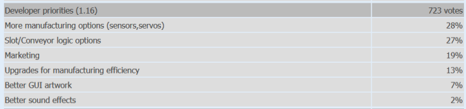
(Thats the last poll I included GUI in) Of course, you have to take this with a grain of salt as these are people who *already bought the game*, so clearly the appearance of the game in videos and screenshots did not put them off. They may be thought of as less-aesthetically sensitive players, and that’s fine and I have just under 10,000 of them now. Yay. You may assume that there are a lot more aesthetically-sensitive players out there who ignore my videos and ads and screenshots because they think the coder art implies an amateurish or low quality game. Somewhere between the two lies sanity.
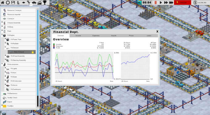
With this in mind, and the games release on Steam early access (and GoG) next week, I have been doing the first few bits of applying the proper pro-artwork design to the game. So far its just color changes and font / layout changes. You can see the current state of the task picker and finance screen here: (click to enlarge)
And here is the new one for version 1.18 (that will be out probably tomorrow and will doubler up as the early-access build). (click to enlarge)
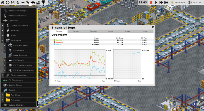
This is not final, and obviously things are a bit messy right now as it looks like I cannot decide between white and black, but eventually there will be a bit more black, and things will hopefully fit toigether better. That top bar will be totally re-implemented with new icons and styling.
This stuff is MUCH HARDER than it looks, because we have to design for a)hardcore players b)casual players and c)2560×1440 res players and d)1280×768 players. That means a lot of artistic compromise and of course no design is going to please everybody. One of the downsides to Early Access is people do get used to an early version, and if for example you prefer the lighter design, then you are going to be disappointed that it changed. Maybe in the long run I will be able to support GUI mods. In the short run, I expect forum/facebook/reddit/twitter arguments about which looks best. Thats early access I guess!
BTW you can now add Production Line to your wishlist on steam:
Things look on target to sort out 1.18 tomorrow. In unrelated news I may have some Democracy 3 updates heading over soon too.