Game Design, Programming and running a one-man games business…

Improving the polls screen between games

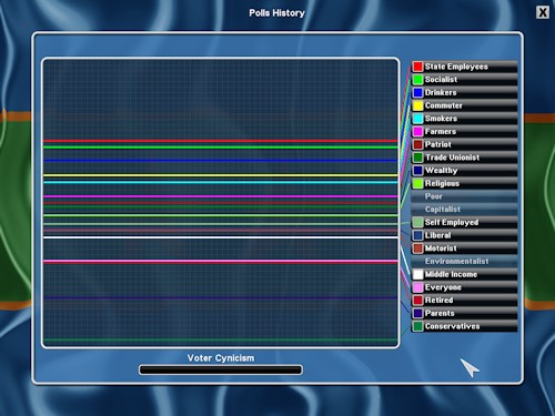
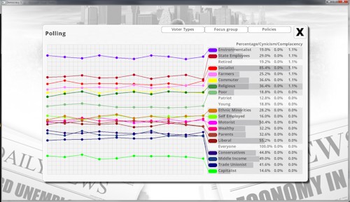
Apart from the fact that it now has tabs for focus groups and policy popularity, I just think that the general color scheme and layout of the new polling screen (bottom) is miles better than the old one (top). Democracy 3 is the game I could always see in my head, I just couldn’t actually make it until now…

democ2polls

democ3polls


8 thoughts on Improving the polls screen between games

  1. oh wow, massive improvement. I think you’ll pull in a lot of new players with the improved look.

  2. Could you explain how the percentages work in terms of cynicism and complacency? For instance if 1.1% of Socialists are described in a polling report as complacent how would this work out in gaming terms?

  3. As someone who’s job heavily involves presenting complex information to people from non-technical backgrounds, often through the use of charts, I’ve got to say I’ve always hated this graph. It’s just completely overwhelming, it’s throwing too much in your face for any of it to get through. The addition of the stuff on the right I think makes this worse.

    A good graph should tell you something intuitively. It should have a message, and that message should be understood, even by someone unfamiliar with the data, within a few seconds of looking at it. If you just want to throw data at someone for them to analyse it, put it in a table where it’s easier to read.

    Here, there’s too many lines for me to consider them sensibly, particularly when they cross over and similar colours are adjacent (in your example above, I have no idea which line is conservatives, middle income or trade unionist). The fact that the axes have no labelling at all doesn’t help either. I appreciate what you’re trying to show with the bar chart showing the size and the lines showing the popularity, but I think it’s too hard to actually mentally link these intuitively.

    Assuming the purpose is to show how your popularity varies with each group over time, my initial thought is to go with a series of pie charts, one for each group, showing popularity, with their sizes dependent on the size of the group. This, at a glance, shows you which groups are the largest and smallest, drawing the eye to the largest (and therefore most important), and showing clearly how many of them like you/like the other guy. Then, for the purpose of showing the change over time, have a slider at the top/bottom which can be dragged across (clearly marked) turns back in time. As you drag it backward and forward, the graphs update, showing how your popularity with the groups has changed and how the size of the groups has changed. I’ve seen this used before, and it’s very effective if done right.

    I’ve mocked up a very basic example of the kind of thing I mean: http://s24.postimg.org/4ahlvxwn9/D3_Example_Graphs.png

    From this, you can immediately see that conservatives are the largest group and you’re pretty popular with them. You’re pretty popular with motorists too, but they’re a smaller group, so maybe you could afford to alienate them if it got more of the vote of the parents, who are currently divided about you and are a substantially larger group. Since I know that parents dislike air pollution because of the asthma epidemic, perhaps I could impose some taxes on car use to gain their favour.

    Whether or not you like my suggestion, I would stress that while your new graph is pretty, it’s basically useless as an informative tool for a vast majority of people.

    As for complacency/cynicism percentages, unless you have an incredible explanation for what 1.1% complacency means in practical terms, I would suggest dropping this altogether. Better, I think, would just have some kind of list saying something like ‘environmentalists are idealistic and somewhat complacent’, with five or so categories for cynicism and complacency. It might be less precise and technically give less data, but the data is useless if no-one understands what it actually is telling them.

    To avoid being totally negative, there are some really good graphs in Democracy 2, such as the income/expenditure pie charts. I refer to these a lot while playing, because I can immediately see where my money is coming from and going to. If I need to squeeze a little more out of my budget, it tells me where I can cut spending or increase taxes to have the biggest effect. I think the only change I would make to these would be the option to group expenditure by sector (e.g. foreign policy, welfare, public services, etc.), just because you can end up with a lot of individual policies. This, however, is a pretty minor suggestion.

  4. Would you consider a dark theme, or maybe a simple “invert colours” option ? I find bright screenfuls of white very difficult to look at for any extended period of time, and the dark theme of Democracy 2 was an important feature in this respect.

  5. Thanks for all the feedback. I actually like the idea of charts showing breakdown by sector, that’s a very good idea. If I understand your suggestion for pie charts that change over time correctly, I’d wager that this would actually be harder to see what I want this graph to convey, which is, for example, that capitalist support is rising over time, whereas commuter support is falling. You can see that in the chart immediately without needing a slider to view time differences.
    I should point out that the right hand side is ‘sorted’ so it lines up with the current value, so you can immediately see current top/bottom popularities. I do need to add some highlighting as you mouseover a line, and ensure toggle options are saved.

    I do intend to add more of an explanation for cynicism and complacency. basically these are effects on the voter happiness. so 1% complacency and 1% cynicism will reduce that groups support by 2%.

  6. I was about suggest you make it so lines can be toggled on or off, but I’ve just realised that this can actually be done by clicking on the names of the group. This makes this graph a lot better, so some of that criticism was from my own ignorance. Sorry for that! I would, however, suggest you make it more obvious this is possible! Also, select all/select none would be nice.

    Additionally, even if it’s separate, some kind of record of the things you’ve done on previous turns would be helpful, and make this more useful. For example, here’s some polling data from a recent game I played:
    http://s1.postimg.org/ippdjlovj/polling.png

    Something I did (circled in red) lost me a tonne of support with conservatives and patriots. But I don’t know what it was, because I have no record of what I’ve done on previous turns, and I don’t even know how long ago this happened because of the lack of a labelled axis.

    Also, thinking about this further, I think size of the group is less important than influence of the group, and is definitely more important to communicate. By this I mean, in the example of the game I have above, liberals HATE me. I have 0% approval with them, and they make up 25% of the population. But I look at the focus group of liberals, and over 3/4 of them would vote for me anyway. This is because, despite the fact that they’re all liberals, being liberal is not the most important influence for most of them. For a couple, it’s not even in the top three. So, while I’m massively unpopular amongst those who care about liberal issues, very few people’s votes are actually affected by this issue. I think the best way to express this is that if you removed the influence of liberal issues altogether, very few votes would change. Equally, if I did something so that all the liberals loved me, again very few votes would change.

    By contrast, parents as a group are around the same size (24%), but hold a huge amount of influence. Parents love me, I have 100% approval with them, and as I look through my focus group, quite a few of these people’s support is heavily based on the fact that they are a parent. If you removed being a parent as an influence, quite a few would change their vote, and a bunch of others would become swing voters.

    I think communicating this is quite complex, but it’s worthwhile. I think part of the issue may be better framing of how opinions work, that you haven’t really got a group of liberals who hate you or a group of parents who love you. You’ve got a bunch of people who have opinions about a wide range of issues, some of which are more important to them than others. As such, it may be better to move away from the idea of ‘26% of people are liberals’ and more towards an idea of issues and their relative importance to the electorate. It’s difficult to make any concrete suggestions because I obviously don’t know exactly how the modelling work for D2, and it’s going to change anyway for D3, but hopefully this is a useful way to think about this.

    Overall, I really like how the voter modelling works and I think it’s one of the real strengths of the game. But at the moment, it either takes a lot of work and a bit of guesswork (or just a lot of guesswork and experimenting) to find out which issues are most important to people and most need tackling. In reality, this is what polling data is all about, and I think in an ideal world, there should be one (or more) graphs that give me that kind of information in the game. I want the equivalent of Josh Lyman telling me I can’t win without the support of the environmental lobby! :P

  7. Nah, josh would say screw the environmental lobby, it’s sam that would be hanging in there for those guys (I’m re-watching this right now :D)

    I agree with you on all points. representing the influence is very hard, but I am wondering about adding ‘event’ popups along the bottom timelines which may explain what has happened, in a similar way to how you can add timeline events to google analytics.

  8. You’re right, it would be Sam. I like the idea of the popups along a timeline. That could be really handy.

Comments are currently closed.