Game Design, Programming and running a one-man games business…

Suprisingly complex health indicators

I’ve never liked health bars in RTS and Tower Defence games. They always seemed annoyingly crude to me, like the designer just thought ‘err…health bars? lets just copy the games from 1980 ok?’. They really break immersion badly for me. Worse still, if you wanted 3 different indicators, for health, armor and shields, you got 3 bars, which was silly.

Gratuitous tank battles solves this with cunning health ‘discs’ only on selected units. The image below shows some infantry with full armor and health, and a damaged turret that has lost some armor. I need to change the code a bit to make the colors relative, rather than always splitting them equally, for situations with high health/low armor etc… anyway…
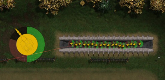
The problem with this system is that to draw the discs programatically you need a lot of triangles to be smooth. Given GTB supports VERY high zoom in and out, that means either blocky hexagons when zoomed in, or triangle-calculation nightmare framerate if you select 500 guys when zoomed out.

The solution is ‘continuous level of detail’ which 3D engines sometimes do with meshes (not sure how common it is), where you basically add triangles as you zoom in, so you have a constantly varying image complexity. The human eye should never notice. With a simple triangle fan, it’s relatively easy. With a big complex mesh, it’s way harder. I know, I worked on Elixirs ‘infinite polygon engine’.
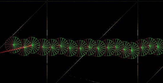
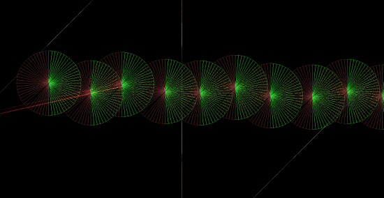
You might think drawing a few hundred triangles here and there makes no difference to frame rates, but it all adds up. I like to write the fastest code I can. It’s also pretty cool to play about with stuff like this. I can’t actually see it happen, even though I know it is, because I can see it happen in wireframe. Nobody playing the game will ever care, but it does add some polish to the game. it makes my GUI look much smoother than it otherwise could have done, given the framerate I’m expecting.


15 thoughts on Suprisingly complex health indicators

  1. Seems like the sort of thing a shader would be fantastic at Cliffski. Pixel-perfect circles at every distance, rendered using a single quad per indicator.

  2. things that go unnoticed always add to the feel of the game, and they are more than worth investing time into. This just adds to the quality of your goods and justifies the price point.

    It’s not as noticeable as driving a 50cc scooter then hopping onto an Augusta senna, but we should apply the same attention to detail as other industry do.

    I’m sure I’ll mention the attention to detail and strive for true quality that you have displayed here to somebody down the pub. That could ping their interest in buying than, say, a loosely detailed multi-player mode. It’s very rare to hear of the personal tweeks devs spend so much time and care tinkering with. Builds up visions of the old mastered watch smith, as oppose to the AAA sweatshop production line.

    Pride in craftsmanship helps heaps when trying to sell your game. I think anyway. And, like you say, it only takes one memory leak/drop in FPS/crash to desktop to complete obliterate your game experience.

  3. How would doing it in a shader be any different? other than pushing the processing onto the card instead of the chip.
    You would still need a backup code path for when those shaders aren’t supported by that card.

  4. But please add a key to show the healthbars of all units on screen. There is nothing worse than to be without vital information in crucial moments and you begin to frantically klick everything in range…

    Just hit e.g. ‘Alt’ and everything is fine!

  5. I just added a hotkey to do this, which is ‘H’, although there isn’t a GUI button to do it. I’ll make sure it’s in the manual.
    You can shift+drag select to select a whole area of units anyway.

  6. As far as I know (though I’m not up to date) most game companies have given up on this technique for arbitrary models after the failed experiments in the late 90s – early 00s. The transitions between detail levels are too obvious for more complex models, making the characters seem like they’re mutating. I think part of the problem is also the way the textures wrap differently when you remove vertices.

  7. Question, what’s the orange circle in the center for?

    If it doesn’t serve a purpose, what about removing it and orienting the missing part of health bars (shield bars) to always be behind the unit (or behind wherever it’s currently aiming)? Since you have shields in this game, it would be immediately intuitive that the health bars represent how much armor/shields they have left to stick into the way of incoming fire.

    You could draw them being thinner at the edges, i.e. crescents.

  8. that yellow circle on the far left is actually the turret base when selected :D
    Green is health, red is armor, blue is shields…

  9. Not sure how much hassle it would be, but perhaps offer the user the option to set their own colors (for these indicators) in the game settings, so that color blind people like me can look at an indicator and not get lost.

    but i agree with you in general, always hated the horizontal bars for indications of various levels of things.

  10. Just wondering, but if units have to lose all armor before their health takes a hit, why show health at all until armor is gone? This way the circle can have 100% red (armor) and 0% green(health). As the unit takes armor damage the green underneath is revealed to you and once the armor is gone it starts showing black (nothing). Hope you understand my confusing shpeal.

Comments are currently closed.