Game Design, Programming and running a one-man games business…

Improving the deployment screen in Gratuitous Space Battles

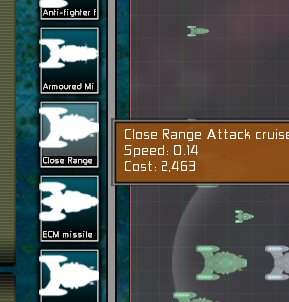
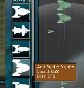
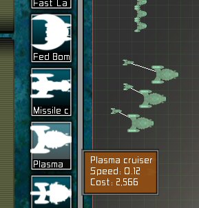
I found this really annoying when playtesting the campaign, and I know people have asked for it before. I want to know if this is an improvement, before I release it in a patch. People were getting vexed because they often had 5 or 6 or 20 cruiser designs of the same race (for example) and the silhouette icons were no help in picking them, so they have to use mouseover tooltips to pick the right one, which is slow. So i have experimented with adding the (cropped) name of the design to the UI: (Please click to enlarge)

Old:

New:

If you play GSB a lot, you might think “yes, I need this!”, but I’d like to know if you think it looks a bit cluttered, or messy, from the point of view of someone just trying the demo for the first time.

Edit: I tried it with a smaller font. Better? or too small?

Newer!:


25 thoughts on Improving the deployment screen in Gratuitous Space Battles

  1. Why not make it “optional.” Meaning: Add another field to the ship designer “Ship Code.” Use the Ship Code to fill the new text area on deployment. New users who don’t need a ship code won’t notice a difference on a null, and experienced users will have a non-chopped code in the field.

  2. Totally in favour. This looks decent, and is WAY more practical.

    Can we have turning formations next? ;)

  3. I’ve never played before and I gotta say I prefer the second one. If anything, I’d prefer even smaller text so I could fit more letters in.

  4. I don’t think I’d put the labels under the selection icons themselves. It does clutter things up a bit and it reduces the number of ship designs you can access without scrolling.

    Why not put the name in the ship schematic section in the lower left of the deployment screen? You show the icon for the ship and the icons for all the subsystems, but there’s no name. This seems to be the ideal location for that data.

    I like @Eich recommendation for color coding, but I’d make the color highlight only appear when you hover over the icon selector. If hovering over the selector highlighted all deployed ships with that design, it’d save me a lot of time when reconfiguring my fleet.

  5. Certainly a must have.
    However the font should be smaller, so it can display more text. 7 characters is not enough at all.

  6. Definitely an improvement, I like it, do it! :P

    @eich: personally I see where your coming from on the white colors, but I don’t want to have to select the color myself, and like the uniformity of the one color. So I’d be sorta opposed to multiple colors, unless it was an aspect of ship design (IE: when I design a ship I can choose it’s icon color) because then silly people like me can leave them all a uniform color.

    Actually upon further considerations of eich’s point, was there a reaon why the actual ship tectures aren’t used on the deployment screen? Becuase personally that would be what I’d like in the white ship space…

  7. i prefer the second version, and would like it even better if the text would scroll instead of being cropped…

  8. I’d rather have the full name show up for *all* ships (maybe reuse the tooltips?) while my mouse is over any ship. Nice and out of the way when I don’t need it, no need to decipher/plan for cropping when I do. Also seems to me like one of those “tiny little changes” that results in a mountain of work to get right / implement at all.

    In the absence of that, I’d rather have the cropped names than nothing at all.

  9. Juho- you can already filter by hull type. Little buttons up at the top of the ship list do that.

    I am so for this. Looks ok to me, and would really simplify things.

  10. I agree most strongly with the improvements suggested by Eich and Dean Thrasher.

  11. A different field in which I could put the shortened name would be nice, with this interface only the race with which is prefix my ship names would show up( such as federation rocket fighter, only federation would show up)

  12. I like the idea of the smaller font but in practice, I think it looks better and more consistent if it is the same size as the tooltips. Personal opinion anyway…

  13. The one with the smaller font for the design names looks better, IMO. I also like the idea of being able to set a shortened name for the ship, and a color.

    Actually, what would be nice is if you added two or more colored dots to each ship. The left or largest dot could characterize the ship’s defenses, the right dot, or multiple dots for its hardpoints, could summarize its weapons.

  14. I think I understand the design philosophy behind the original UI: players should be able to recognize the ships based on their silhouette, with tool tips providing verbose information when required.

    A question then: how does the name of the design help the player make a choice any more than the the silhouette does? Does this mean the silhouettes are not conveying more critical information, such as the speed/cost?

    I admit to not having spent as much time with GSB as I’d like, but an “ignorant eyes” solution would be to iconograph further with role icons in the corners of the silhouette boxes, or reduce the overall size of the silhouette and put the whole role/speed/cost info into each box.

    In any case, I think cut-off text is an aesthetic no-no, and should be avoided at all costs. Heh, personally I think text should be avoided wherever possible… :D

  15. In a perfect world, the design posted by Eich (user-selectable color codes set on the design screen) would be combined with the Joshua Zusmer idea of an optional text field on the ship design screen. If you choose to do nothing on the ship design screen, things stay how they are now. Or you can choose a color for each ship, or you can give them a short codename to be displayed below the icon, or both.

    Of course that’s a lot of time that you could otherwise spend on the gratuitous campaign or the next pack of ships we are looking forward to. So do something easy. :)

  16. I like it better with the smaller font, but I have too many ship designs, and I tend to make hierarchical names for them, so showing the beginning of the name wouldn’t be all that helpful. Showing the name in the schematic section would definitely help, and having colors and/or a short code might help too. I think the easiest thing for me would be a filter-by-name text entry box.

  17. /A different field in which I could put the shortened name would be nice/

    This.

    And yes, a great idea overall, no matter how you decide to implement it in the end.

  18. What I’d like is a way to further control groupings of ships. The way the 3 button ship-size filters work, but more expansive.

    I have a series of ships that are designed to fight inside a nebula where there are no shields. I’d love a way to filter ships based on my own specifications. A sort of customized groups. This would make it easier to have a larger variety of ship designs.

    One way to do it would be, when designing a ship, being able to choose a group for it (which includes creating & naming a new group). At the deployment screen, in addition to the 3 ship-size button, add a drop down of all the groups with the initial selection being “All Groups”.

  19. Cliff, one thing that bugs me.

    Like most people I suspect they like to place ships by type order, but then as I’m still placing Cruisers and think I want to tweak one, I go into the build amend etc then go back to the deploy screen… and the deploy section is re-set, showing all types of ship type, not the one I had filtered.

    not a massive glitch. but nether the less, annoying.

  20. I rather like the smaller text on the design buttons. It makes them much easier to pick out from a large group of designs.

Comments are currently closed.