I have been a bit quiet on the blog front, but in case you were wondering, yes I am definitely still working on Ridiculous Space Battles! Right now I am thinking about the ship and fleet design for the campaign game, and this is forcing me to think more about the usability of the deployment screen.
For a bit of a history lesson, here is the deployment screen from the original Gratuitous Space Battles:
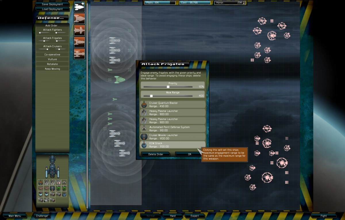
There are so many things wrong with both the style and the layout I do not know where to begin, but given GSB was the first auto-battler, there was both no competition, and no other examples to be inspired by. Anyway, one of the many bad things about this UI is those circles around every turret on every ship that were supposed to show the player the weapon ranges, but in fact just look like a confused mess. Here is my current version of the same screen in Ridiculous Space Battles:
I think its so much better… but specifically I am working on the range and fire arc overlays. They only show for ship(s) that you have selected, and one of the changes I have made is to color code them as red for short range weapons, white for mid range, and green for long range. Like *anything* in game UI design, there is no perfect answer here. Red for short and green for long feels right, as long range is generally good (assuming everything else is equal). Making mid-range yellow might be a step too far in mirroring those order strips to the right, so I decided to go with white…argghh…who knows!
The problems arise a bit once you have a bigger battle and with multiple ships selected:
Now the red is showing the combined overlay of the short range fire arcs for all selected ship weapons. Be aware a ship might have 7 different weapons, and could be in a 4-ship or 25-ship squad… Its a complex thing to visualise, but its getting better!
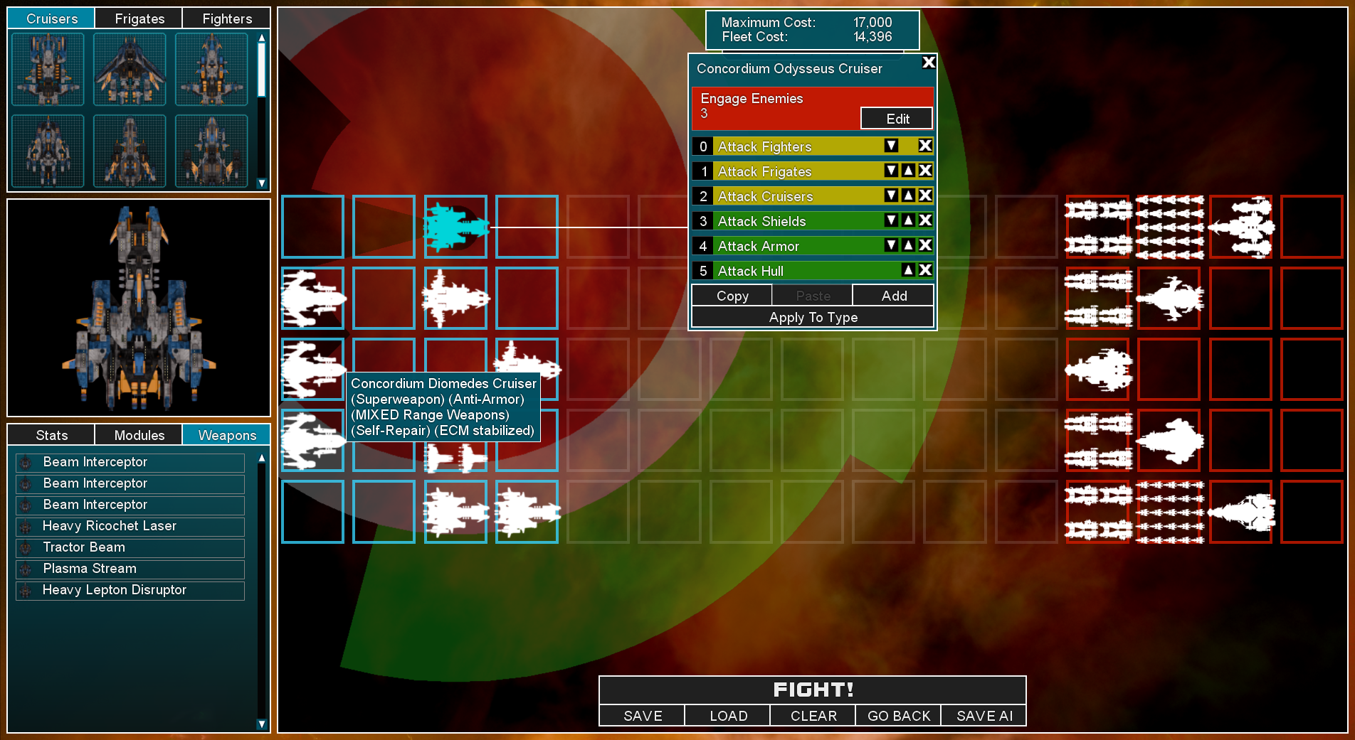
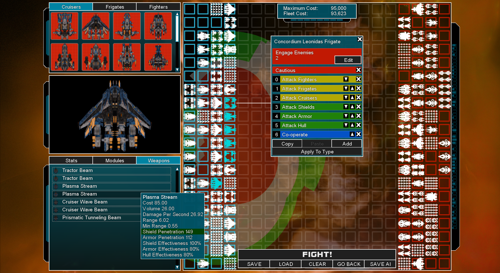
In addition to fiddling with this overlay UI, I have also been improving the ‘ship role descriptions’ that are shown as tooltips for a ship design. I’m basically approaching the problem in 3 different directions. Select a ship…and the overlay should show you its weapon ranges on the map. Select a ship-type at the top-left, and then hover over a weapon name, and you get that big tooltip (see the one for ‘Plasma Stream’ above), which lists everything, including range. If the range is especially low or high, it gets a colour (red/green) highlight. Thats true for shield and armour penetration too…
The thirds method is the mouse-over tooltip for the ship types in the top left ‘ship-picker’. The game analyses all ship types and gives them various descriptive tags (I call them Roles in code). Those might be ‘Mixed Range Weapons’ or ‘Anti-Armor’ or ‘SuperWeapon’, or a bunch more.
My goal is to be able to help the player remember which ship design is which, so they are not just blindly spamming down a bunch of ships and hoping for the best. Ideally you have some short range ships serving as tanks at the front, absorbing enemy fire and shooting down incoming projectiles, then deeper ranks are mid-range and long range, or ships with shield support beams. Choosing the right formation and deployment should be a big part of the game.
Anyway, thats what I’m working on right now. The list of stuff to do before Early Access release does keep getting shorter (I think). Anyway, don’t forget you can wish-list the game at https://store.steampowered.com/app/3607230/Ridiculous_Space_Battles/