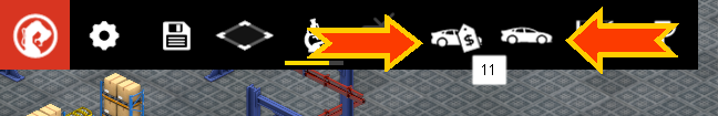
My car factory game currently has two separate dialog boxes launched by these two icons on the top interface strip in the game world:
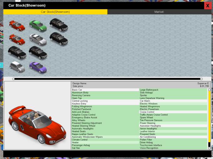
The one on the left is the ‘car showroom’ dialog and it looks like this:
…and the one on the right is the car design dialog and it looks like this:
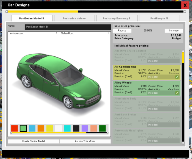
I have some design issues with the way this works, in terms of it being a nice logical and intuitive user-interface. Firstly, those two icons are not really distinctive enough to show that one means ‘the car market as it currently is, plus your showroom’ while the other means ‘design of your cars’. Secondly its not immediately clear why they are separate dialog boxes at all. There is some justification for having 3 buttons and 3 windows (market, showroom and designs) or a single one with 3 tabs called ‘cars’, but very little justification for the current layout. In addition, the car designs window is currently different dimensions to the showroom, which feels weird when switching between the two, and to further complicate the issue, clicking a design in the showroom dialog launches the car design window to show that model…
My gut instinct is that this is just poor design, resulting not surprisingly from the design evolving during the games development. Initially the showroom was a single window, then it got the market added as a new tab, and the overall design of this stuff has not been revisited with fresh eyes since it got added.
The problem with just changing it, is that existing players of the game are going to initially wonder what happened. I can put a note in the change-list, and mention it in my next blog video, maybe even have a first-run popup, but there is always the possibility that some players may prefer it the way it was. Of course the game is still in Early Access, so really players should be expecting that the design would evolve, and I think the majority would welcome the change, but its still something I hesitate to do without canvassing some players opinions.
For existing (or for that matter new or potential…) players, what do you think about changing this? Would a single window (and thus button) make more sense?