Making a game where you fully support a wide range of screen sizes is a real pain. Its a pain for any genre, but the biggest problem has to be the strategy / management genre, because of the need to display so much information. When there are a lot of stats, tables and charts, you cannot just leave GUI elements designed for the smallest supported resolution, because if you do,m you end up with tiny dialog boxes in the middle of huge screens, and a lot of really annoying and unnecessary scrolling.
The simplest option probably seems to have the size of the GUI just fixed and scale with the screen, and only allow larger monitors to make use of your 3D/2D/Iso world. This is simple to do, but it looks horrendous. As someone who sits all day in front of twin 2560 res monitors, I can testify that s GUI designed for 1280×720 res makes a game look like some sort of children’s toy when simply scaled to fit a big screen. Its not a problem with pixelation, even super smooth text looks silly when its ten times the size of your normal windows font. There is simply now way around the problem, you just have to make your design adapt to different screen resolutions.
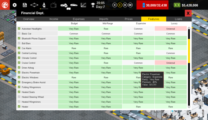
The problem comes when you have a screen like this (the features window) in production line, seen here at 1280×768 res:

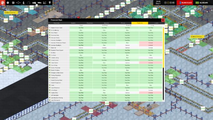
This kind of looks ok, maybe slightly cramped because the top of the dialog interferes very slightly with the top strip of the game, but otherwise, visually its ok. When we take a look at the same screen sized for 2560 res:

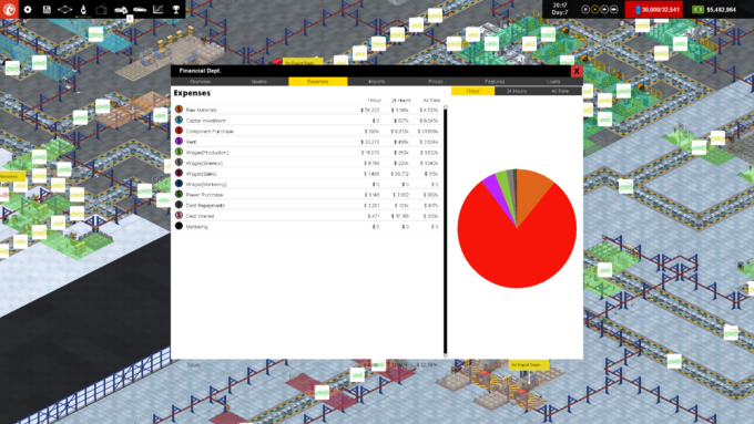
It looks ‘ok’ but the nice aspect ratio of the dialog has changed to be a bit less pleasing, and I’m wary of making that worse so don’t extend it height-wise any further. I could stretch it width-wise too, but then the table becomes disproportionately white-space and is perhaps harder to use. What I suspect would look better is to add a pure black ‘footer’ to the bottom of the dialog like I have on some other windows… If I look at another tab:

Its suddenly ugly as we now are showing a scroll bar we don’t need (I’ll remove that), and that pie chart should probably be top aligned rather than sat weirdly in the middle. The big question is what to do with the bottom. Even with a nice black footer-strip there is still a ton of glaring whitespace. I *could* resize the dialog depending on what tab you are on, but that is not normal and might be jarring. I could add some extra interface here, maybe showing line charts of a selected item over time, bu then suddenly I have this whole new GUI element thats only for people with big monitors…which would lead to complaints.
Ultimately this just all comes down to time, fiddling with number and ratios, maybe even fonts, to get a GUI that is usable, looks appealing and works over every supported screen resolution. I suspect that the majority of hardcore strategy & sim players tend to have big monitors, but then again these singleplayer management games are also very playable on a laptop, so you have to support both ends of the spectrum.
In any case, it feels good to be able to spend some time on this stuff. Frankly, although I think the core game is fun, and there is a decent amount of content at the moment (more will come though…), Production Line probably suffers a little bit from being a complex game without sufficiently smooth GUI or decent enough guides & tutorials to get new players into the game. There are some GUI elements that are frankly pointless, and some vital information (competitiveness of the market, for example) that is hidden away and not really called-out. Anyway… its getting better every day.
By the way, we are still donating 100% of our steam income from Democracy 3 to War Child this week, already raised about $5,000 for children affected by war, spread the word!